Jakarta has long caught on the trend of izakayas and now, you might have been one of the numerous Jakartans who have been frequenting such type of establishment. A Japanese concept, izakaya is a small bar that serves alcohol and small snacks whose clientele are males of various ages and backgrounds, usually to wind down after work.
While the traditional type of izakaya presides over Jakarta – yes, that wood-dominated, subdued-lighting, and often cramped establishment – izakayas have evolved in other parts of the world, such as in Australia, where the food and interior receive a twist. However, the biggest overhaul has to be the visual identity (Melbourne’s Supernormal naturally pops in mind), and it’s safe to say that Birdman has made a benchmark for a restaurant of its kind in Jakarta.
Birdman’s visual identity is designed by Thinking*Room, a design studio based in Jakarta that is also responsible with the visual identity of Pippo, Lola, The Goods Dept, Indoestri, and Coworkinc. Led by Eric Widjaja, who is also its founder and design principal, Thinking*Room is revered as one of the prominent design studios in Indonesia.
However, according to Eric, they weren’t the first design studio responsible for the visual identity. “The steps were unlike the usual methods we went through. Normally, in our past projects, we gave out a questionnaire to the client to find out how they envision the identity. But for this, we ‘inherited’ the works from the previous studios.”
Accustomed to starting from a blank canvas, Eric came to find that the upside of a ‘passed-on project’ is, in fact, the clear indication of what the client wants and does not want. “The client showed us the design that the previous studios came up with. ‘I don’t want something like this,’ he said. So we had a parameter set to continue with the design,” says Eric.
Birdman was a name the owner came up with. The client, owner and Co-Founder Christoph Darjanto, who also co-founds F&B establishments Monolog, de Luca, and Olivier among the few, says that since the start, he wanted to create an original take on the Japanese izakaya, “With modern, experimental Japanese [combined with] other cuisine’s approach, so that we can imbue some of our original thoughts and knowledge without losing the core of Japanese cuisine and culture.” And the moniker Birdman, was taken as “a code of poultry (bird or tori in Japanese) as it is the kitchen’s main take, and also happened to be one of Alejandro Iñárritu movies of the same name.”
Thinking*Room team saw this as an opportunity to expand on its identity, where they gain the inspiration from the term ‘strange bird’. “Bird is a word that you use when describing an odd or eccentric person,” says Bram Patria Yoshugi, who is the graphic designer in charge for Birdman’s identity, along with Art Director Ritter Willy Putra. Then the team went on a quest to seek the correlation between izakaya bar and the name Birdman itself. One prominent question was raised: what kind of people frequent izakayas?”
An izakaya is a melting pot of strangers who want to take it easy after their daily grind. It’s also a place where anyone is free of their social roles, so to speak. “They could interact with just about anyone without having to wear a mask. They could project their real self there,” says Bram.
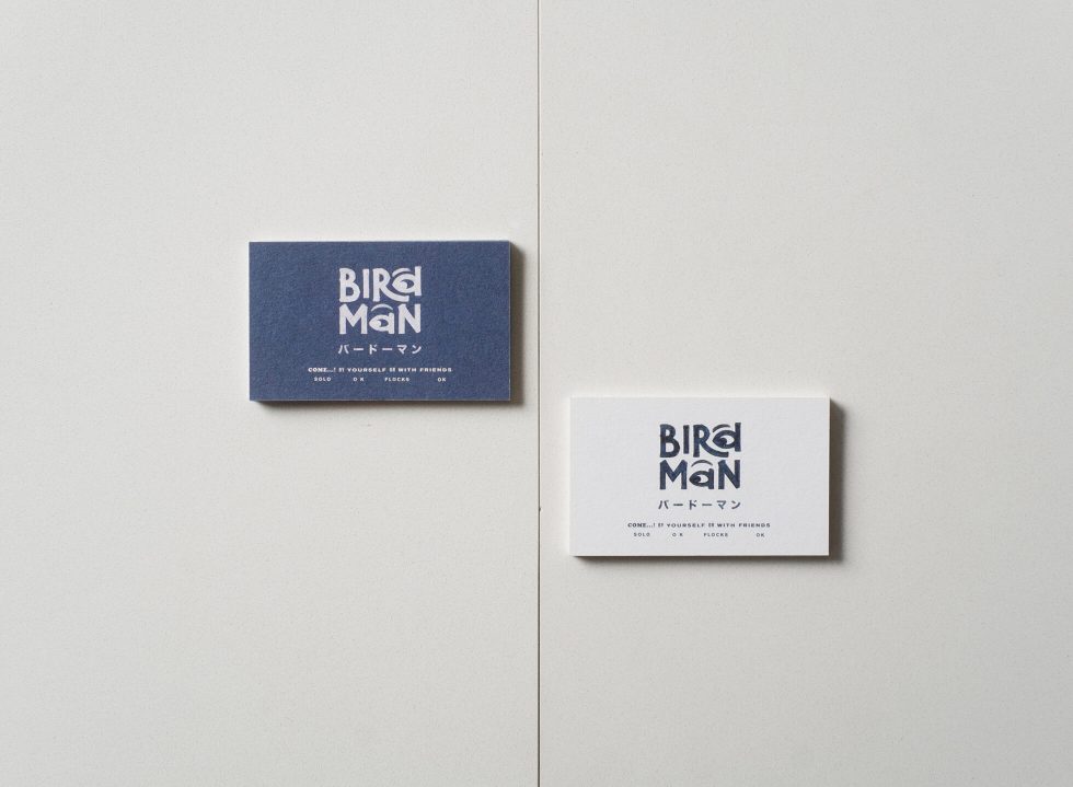
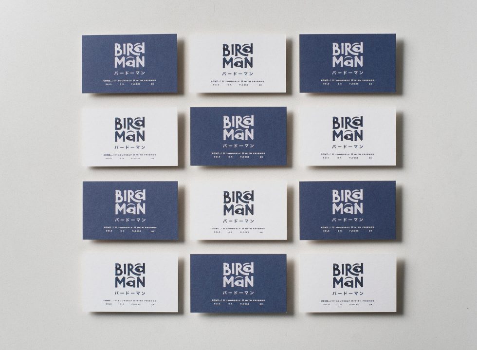
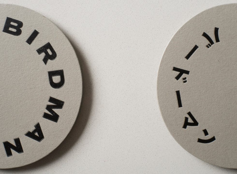
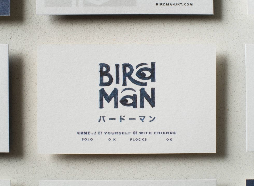
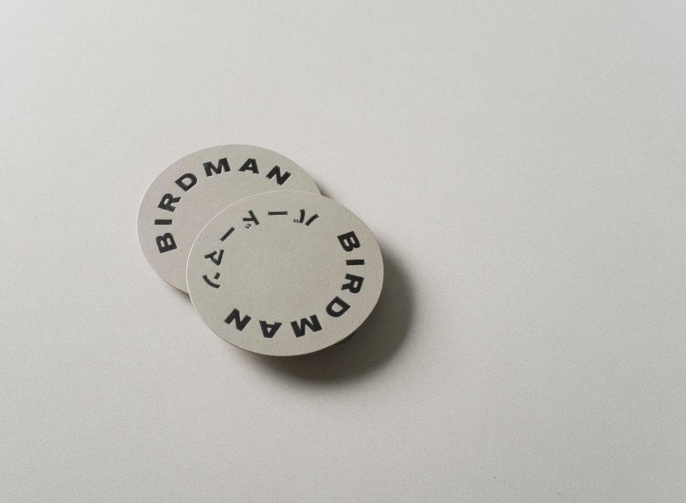
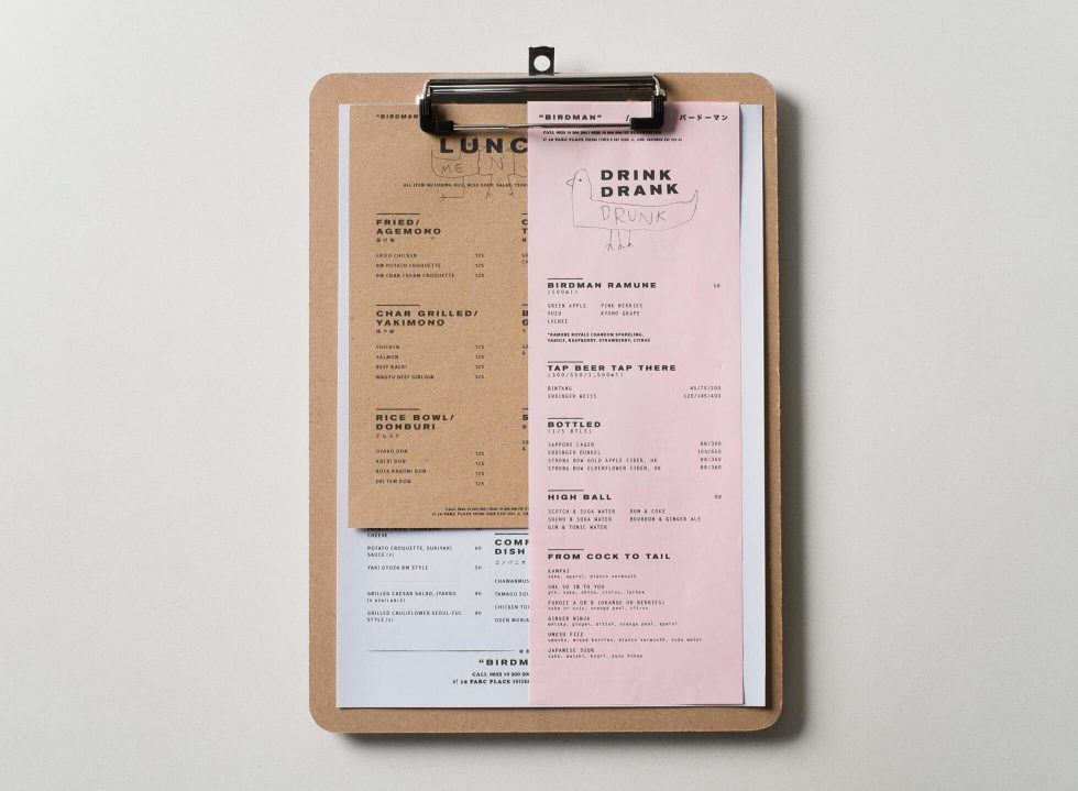
Although Birdman doesn’t have a logo, yet this personality is infused to the logotype. It isn’t based on an existing typeface; rather, creatively bespoke as it is the more polished version of Christoph’s rough sketches. It is entirely hand-drawn, bearing the word ‘BIRdMaN’ with the letter d and a that morph into eyes. “[Eyes] are the windows to the soul, and when we look at someone in the eye, it means we are confident and free from the fear of being judged,” reads an explanation of Birdman from the studio’s website.
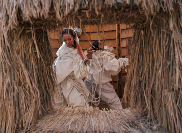
Birdman, in a similar manner to its identity, is somehow, the odd one out as well among its izakaya peers in Jakarta. Claiming to be a Melbourne-style izakaya, Birdman is sleek, sophisticated and contemporary. It’s also clinical in a way and surprisingly devoid of the element of wood, a prominent fixture of izakayas.
“We’re trying to avoid [the mood of] the traditional izakaya bar. Birdman took quite a bold step. To be honest, what we had in mind is something like Yardbirds, an izakaya in Hong Kong. We wanted to avoid paper lanterns and wood [for its identity],” says Eric. The result is a visual direction that is subtle, witty, yet uncomplicated. Like Christoph says, he aims it to be “a place to have a drink while getting some bites. No frills.”
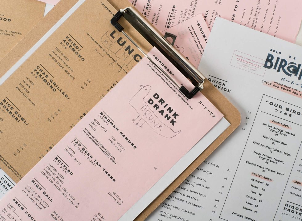
And thus, the colour schemes are equally understated – navy blue, a colour that is frequently found in izakayas, and a neutral tone to balance it, grey. As an afterthought, a pop of colour is added subsequently. “I think it’ll be funny if we add a dash of colour that is striking, but remains subtle for a twist. Thus we came up with pastel pink as an accent,” says Eric. Among the predominant blue and grey, the pink is a quirk in its own, that ties in to the character of Birdman.
Added to that, is yet another quirk found in its playful tone of voice as observed from its grammatically-imperfect tagline, a hint to blunt translation that is quite common in Japanese restaurant’s menu: “Solo OK, Flocks OK”, implicating that it doesn’t matter whether you come alone or with your clique to have a relaxing meal or drink.
Funnily enough, one of the biggest challenge for this project is making sure the identity of Birdman doesn’t overpower the star of the restaurant: the food. “You don’t want to overcomplicate the identity because it will give the impression that you’ve made quite an effort to come up with the concept. That’s why, we tried to find a good balance between spontaneity and wittiness. It’s as if we tried hard but don’t want to appear so,” says Bram.
Indeed, they succeed. Even though Eric himself admits that the process was “tough”, it’s hardly apparent in the outcome. Those who are attuned to Jakarta’s F&B scene may have been irked by its prolong infatuation with everything pastel that will surely wane in the near future. Birdman here, surpasses the trend and, clearly, it’s the odd one out. In a good way, of course.