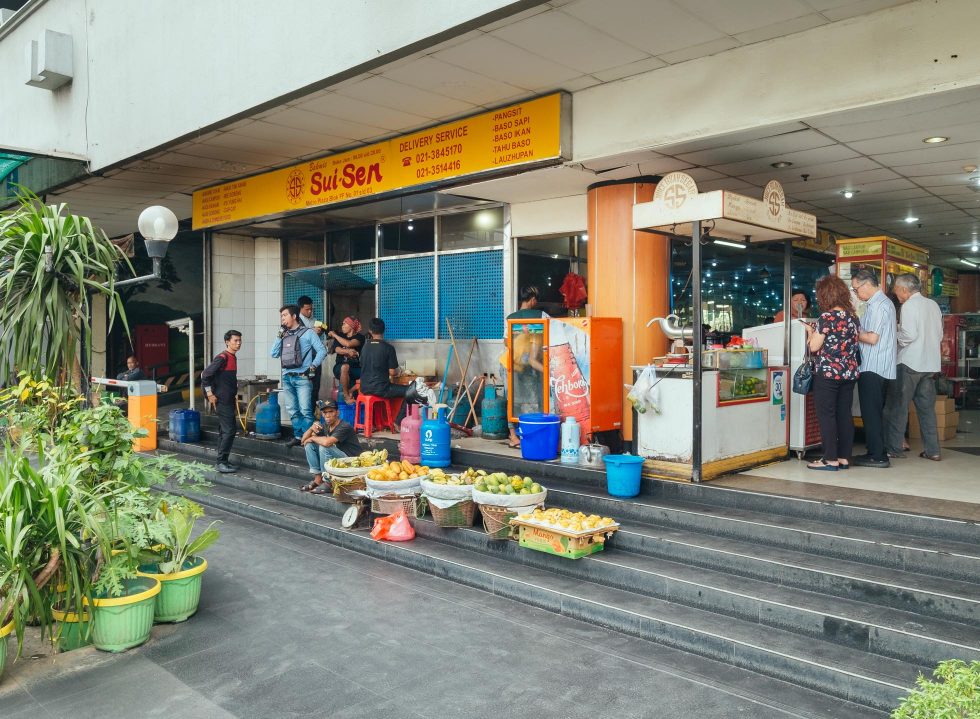
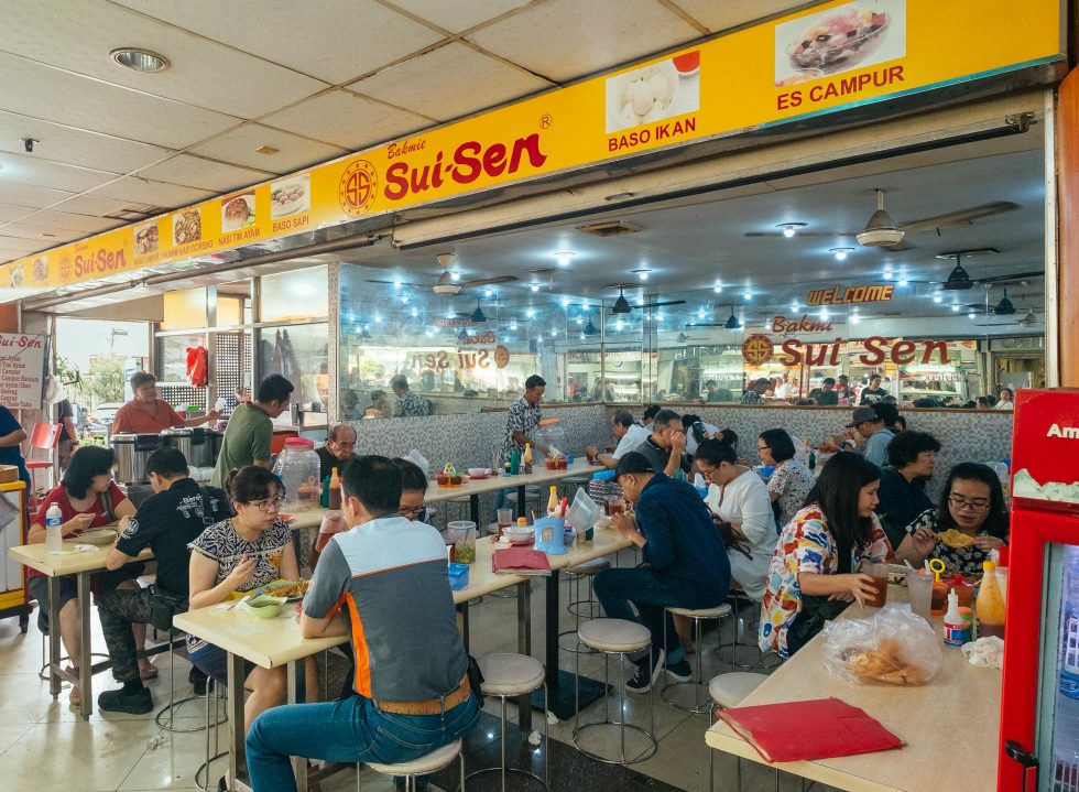
Inside Pasar Baru’s lively shopping centre lies Bakmi Sui-Sen, a 40-year-old bakmi outlet where bowls of comforting Chinese staples are served daily to diners. Their food stall, bold with red and yellow tincture found in the rest of their shop, exposes an enticing sight that calls for a wolfish treat: roasted pork and chicken hung heavy, while other selections of sides lined up in disorder. To many, this might be the only sight worthy of attention, but to the observant, Sui-Sen’s unabashed visual identity is something to uncover.
This type of visual is what one associates with vernacular typography, a “form of expression by the local community in which the people are not formally trained in the design or creative field, and therefore the everyday culture became their main influence,” said illustrator and Art Director of Thinking*Room Ira Carella.
Marked by recurring patterns of type font, colours and materials, vernacular logotypes charm with the nostalgic impression, that oftentimes, gives way to misconceptions in which personal stories and nostalgia are assumed to be the design’s core influence. Though this notion is not entirely false, the drive behind vernaculars is far more complex and significant than its surface: shaped by history, native communities and educational and/or technical limitations, vernacular design is not only a creative or cultural practice but freedom of expression and language in itself.
In this round of Matter of Design, we take a closer look at these visual expressions espoused by age-old establishments in the city, namely Bakmi Sui Sen, Kopi Es Tak Kie and Paramount Cantonese Restaurant.
Vernaculars: Chinese eateries
“Vernacular design is always about the people,” said Ira, whose past research project explored the cultural and historical context of vernacular typography around Bandung. “For instance, the vernacular expressions in Glodok are heavily influenced by the everyday culture of the Chinese citizens in Jakarta. This can be seen from details such as writing the names of several shops using d.h (dahulu, meaning “formerly”) to indicate its Chinese name, or the depiction of logos with animals, lucky numbers to fairly extensive use of red,” she recounted when asked about Sui-Sen’s insignia.
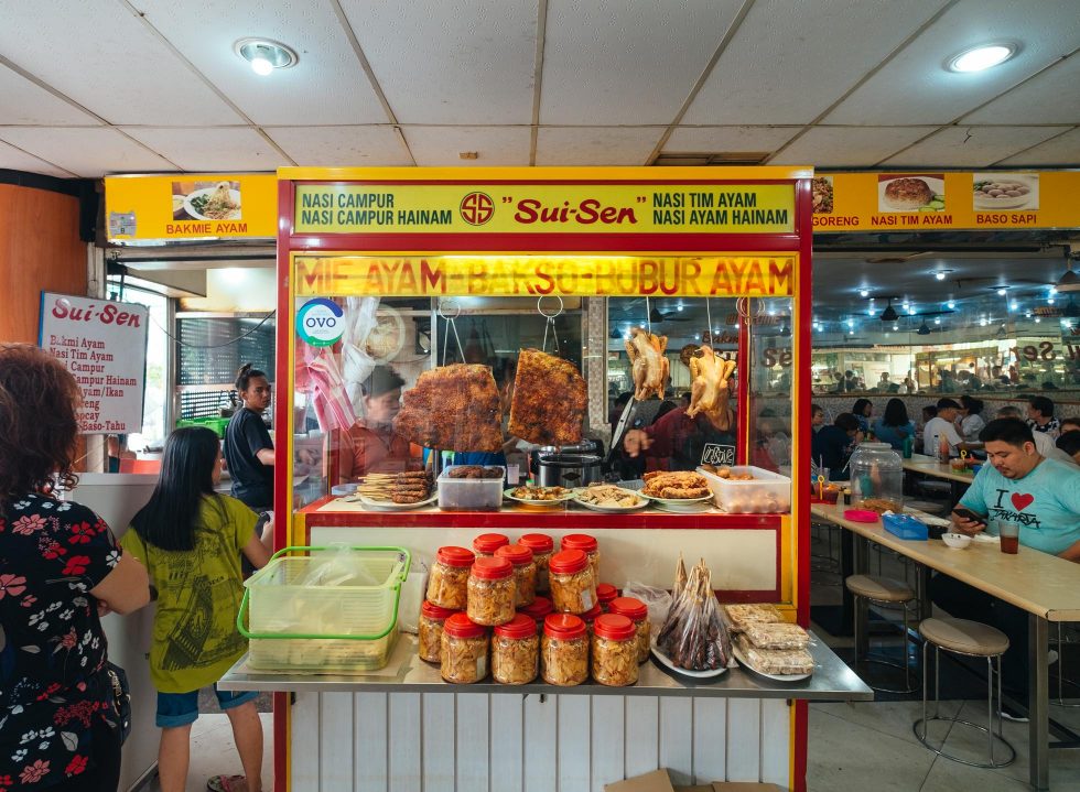
Flushed in red and yellow, the bicoloured logotype bespoke the conventional practice of pairing two different colours, something that has long been the norm to traditional Chinese eateries, such as Restoran Trio or Bakmi Gang Kelinci. Further incorporated in this visual expression is their ever-distinct logo that flaunts their initials, SS, in a round vector circled by twelve minuscule stars.
Against the yellow backdrop, Sui-Sen’s red typography—which comprises two different typefaces—holds a playful impression: ‘Bakmi’ is printed in cursive, while their moniker ‘Sui-Sen’ is shown in boldface character and bigger fonts. At a glance, the lettering is almost identical to that of Bakmi Naga, a franchise bakmi restaurant established in 1979.
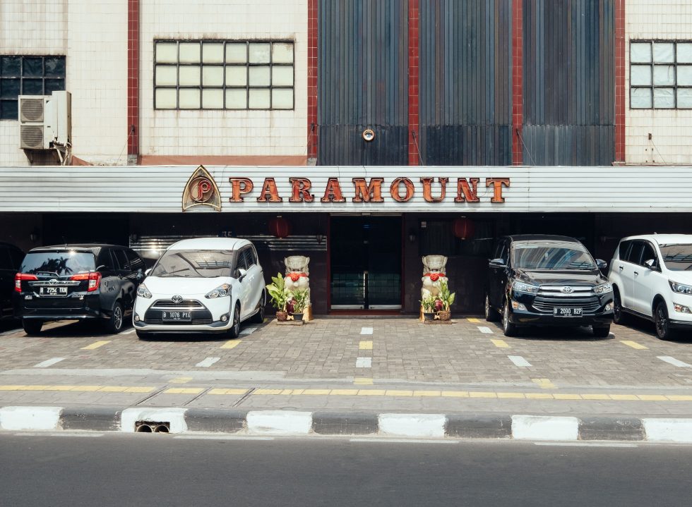
The tradition of using red, or hóng sè, traces back to early Chinese civilisations where the colour is believed to bring luck and happiness; similar to Bakmi Sui-Sen, Paramount Cantonese Restaurant embraces this philosophy and cultural legacy with pride. Sited in Menteng, Paramount’s quaint building showcases a red, old-school logotype that reads their namesake. At night, the signage glows amongst the row of worn shophouses, as if it were a reminder of their earned reputation as one of the prominent Chinese diners in the neighbourhood.
Though incorporating red is a staple in the Chinese tradition, there was another cause for why the colour is used extensively among Jakarta’s vernacular typographies: “Back then, there were only premiere colours such as black, red, blue, and yellow since the only tool available was a letterpress machine. So, no doubt that these limitations greatly affect the design logos [in that era],” explained Rakhmat Jaka, a designer in Jakarta-based graphic design studio Visious.
Paramount’s logotype, shown in bold capital letters and classic typeface, comes with an emblem that highlights their initial; an archetypal design approach in Chinese eateries. Reminiscent of a badge, the emblem gives off a less orthodox design with a hoop-shaped, lowercase ‘P’. The red undertone doesn’t stop at their neon-lit signage, for upon entrance, one will be greeted with a downright oriental setting that spoke of Paramount’s good fortune.
“Unlike the vernaculars seen on street food stalls and public transportations that tend to be spontaneous with elements of self-taught craftsmanship, the logogram or logotype in traditional restaurants tend to acknowledge simpler design style with supporting elements that are very commercial in nature,” examined Jaka, who also runs a vernacular-inspired fashion label Lookall. “Depending on the maker, the logotypes [in traditional restaurants] can still be considered as vernacular if [the designer] is an autodidact.”
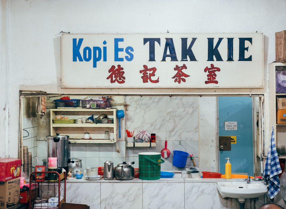
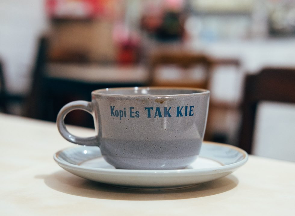
For Kopi Es Tak Kie, whose name bears the meaning “wise” (Tak) and “memorable” (Kie), the moniker is “based on the Mandarin language Tak Kie. Back then, many [Chinese] eateries incorporated the word Kie because it is often identified as Hoki (luck)”, expressed superintendent of the coffee house Willy Yulus.
Established in 1927, Kopi Es Tak Kie keeps their authenticity intact: ‘Kopi Es Tak Kie’ is printed in blue sticker decal, a method widely used during the era, while their Mandarin lettering, 德記 (déjì; kindness, to remember) and 茶室 (cháshì; teahouse—traditionally similar to a coffeehouse) is printed in red.
“Our first signage was fully in Mandarin, and three years later, we used the old [Dutch] spelling ‘Kopie Us Tak Kie’, and the one we are using was created in 1974,” remarked Willy, who is also the son of Latief Yulus, the man behind Tak Kie’s coffee recipe. The story goes that the landlord of their humble shop was a Dutch-speaking Chinese, and back in the days, Latief hosted a legion of Dutchmen who would stop by for coffees in the afternoon.
To date, everything spotted in the OG coffee house in Glodok’s Gang Gloria remains unchanged, including their photographs, ornaments and their iconic signboard. “We have no plan to overhaul our logotype since the Mandarin lettering has become familiar to many people,” Willy deduced.
Today’s vernaculars
Vernacular typography in Chinese eateries is only part of what makes Jakarta’s urban design distinctly unique. On top of that was the limited access to a vast range of colours that spurred locals to explore through playful font styles, reflected in the monotonous colours used by Sui-Sen, Paramount and Kopi Es Tak Kie.
Despite the scarcity of comprehensive studies regarding vernacular design in Indonesia, works inspired by the design practice can easily be found in today’s modern landscape from F&B namely Pelaspas’ trendy bakmi joint DEMIE to as far as the music scene as hinted on off-skelter duo DJ Gabber Modus Operandi, whose visual works showcase elements seen on street food banners to Chinese vernaculars.
“The thing that makes vernacular design special is its dynamic nature. When I was doing my research on the course, it felt like I was seeing a track record of a time,” shared Ira, who has researched on the city’s Chinese vernacular design for Thinking*Room’s joint collaboration with Footurama, Project GLODOK.
Although these traditional establishments have outlived decades of both tests and triumphs, their nostalgic design lingers in the tech-driven jungle a world away from their time. Fashioned from imprints of history, self-taught community and limitations, their visual identity goes beyond a part of certain narratives or serving personal backstories; today, they also serve as inspiration for the modern, ever-evolving design culture.