
To this day, Jakartans’ love for bakmie lives on. Bakmie is rooted in Chinese cuisine, composed of a bowl of noodle, topped with minced pork and pangsit (dumpling), and served with a bowl of broth. Traditional bakmie eateries are just as simple as the meal, where plastic stools and communal tables coexist with minimal décor. Most bakmie eateries are still bearing this modest face – untouched by trends and modern design concepts. This is especially true for the decades-old eateries that mostly reside in the north and west Jakarta.
Since its opening in 2018, DEMIE Bakmie made the mark as the few halal options for a bowl of bakmie in south Jakarta. Not only for its fares, but it’s also its unique visual identity that leaves a nostalgic mark amongst patrons.
DEMIE Bakmie’s visual identity is created by Michael Killian, who’s behind the visual identities of Zodiac and has worked on Potato Head Family Group’s Three Buns and Katamamama Hotel in Bali. For DEMIE Bakmie, Michael aimed to create “something different, that’s amusing, fun and frivolous.”
Michael also created the brand’s design guideline that he’s passed on to the team, namely co-owner, Joey Mahendra. “We wanted to make the name as catchy as possible,” said Joey. Indeed, a perfect rhyme is created between the first syllable, DEMIE and the following, Bakmie, that would roll of one’s tongue.
Notably, DEMIE is an interplay of the terms ‘demi’ and ‘mie’, where the former is a common slang among Indonesian youths (the term is generally used as a swear term). As such, ‘DEMIE’ denotes the brand with a youthful identity.
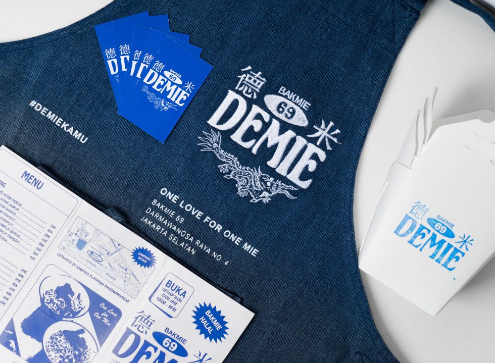
Despite its trendy nature, DEMIE serves up bakmie inspired by traditional flavours found in age-old bakmie eateries to the west and north of the city. This juxtaposition between tradition and modernity is first and foremost realised with DEMIE’s logotype. “Michael came up with the logo after we said we wanted to offer a traditional taste of bakmie [from the north and west Jakarta],” said Joey.
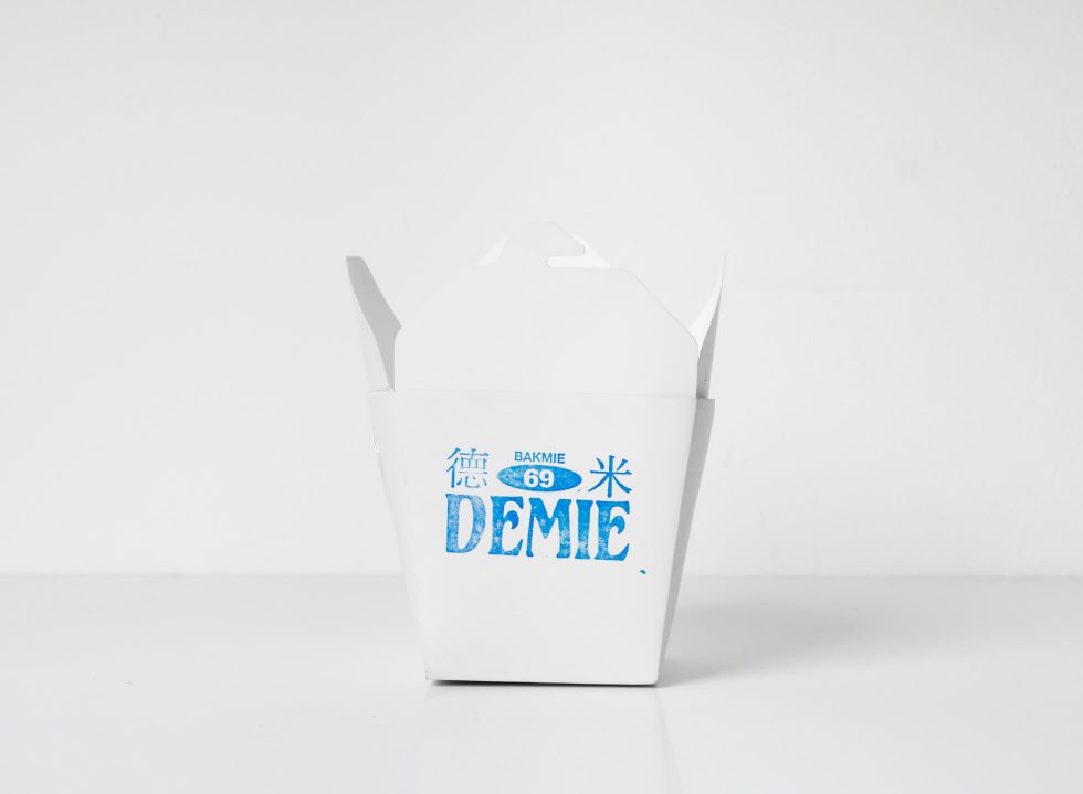
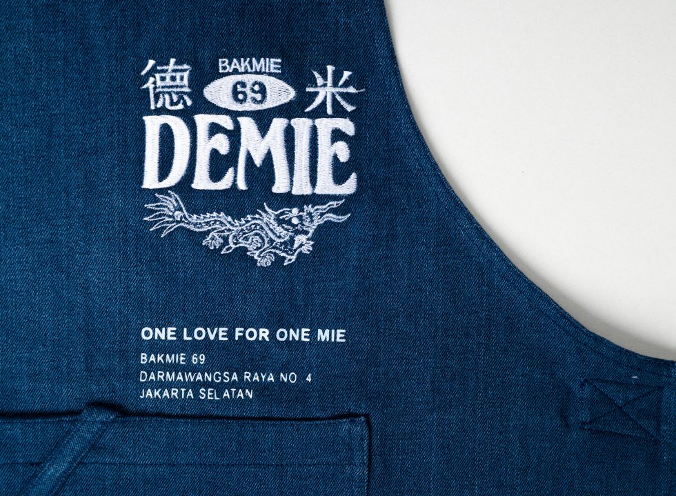
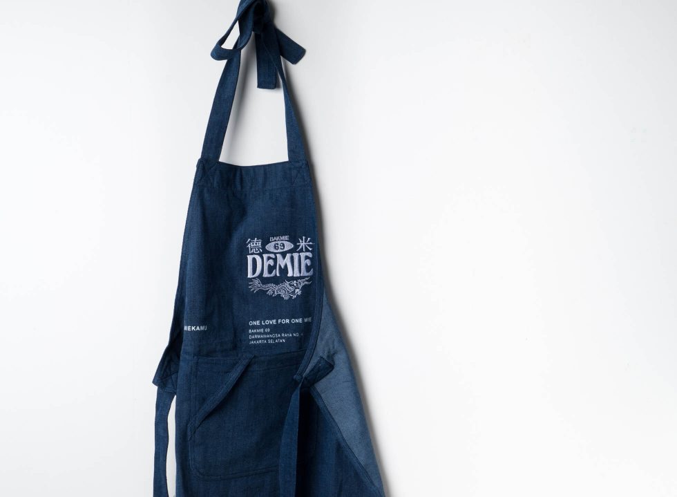
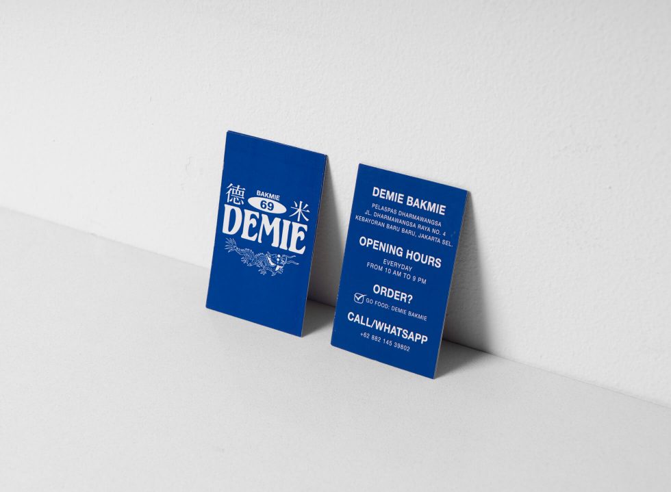
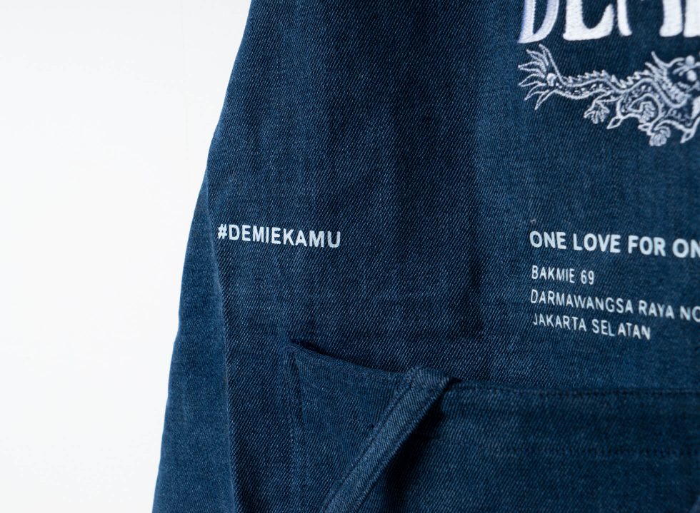
“The idea is to have bakmie in the south that offers the quality of bakmie found in Kota. This message has to be delivered clearly to the market,” said Michael. For one, Michael visualised ‘DEMIE’ in a bespoke classic retro typeface, accentuated in larger font size for brand memorability. A visual element of a dragon is added below, which Joey reasoned, “There’s no other animal that represents Chinese tradition better than a dragon.”
Not to mention, the cheeky ‘69’ is fashioned in a classic typeface, which is also represented alongside its Chinese numerals. What is in fact inspired by a Chinese tradition (where numbers are predisposed to bear good or bad fortune), is twisted and rebelled to suit DEMIE’s playful and cheeky attitude.
Instead of the orthodox red (a popular colour in Chinese tradition that symbolise luck, joy and happiness), blue and neutral tones are chosen to imbue the brand’s logotype. With references from the Chinese porcelain or China, the colourway portrays Chinese heritage without being overtly traditional. “Red would be a safe choice, but it’s nothing special,” Michael explained. What resulted is a modern and catchy logotype that hatches nostagia.
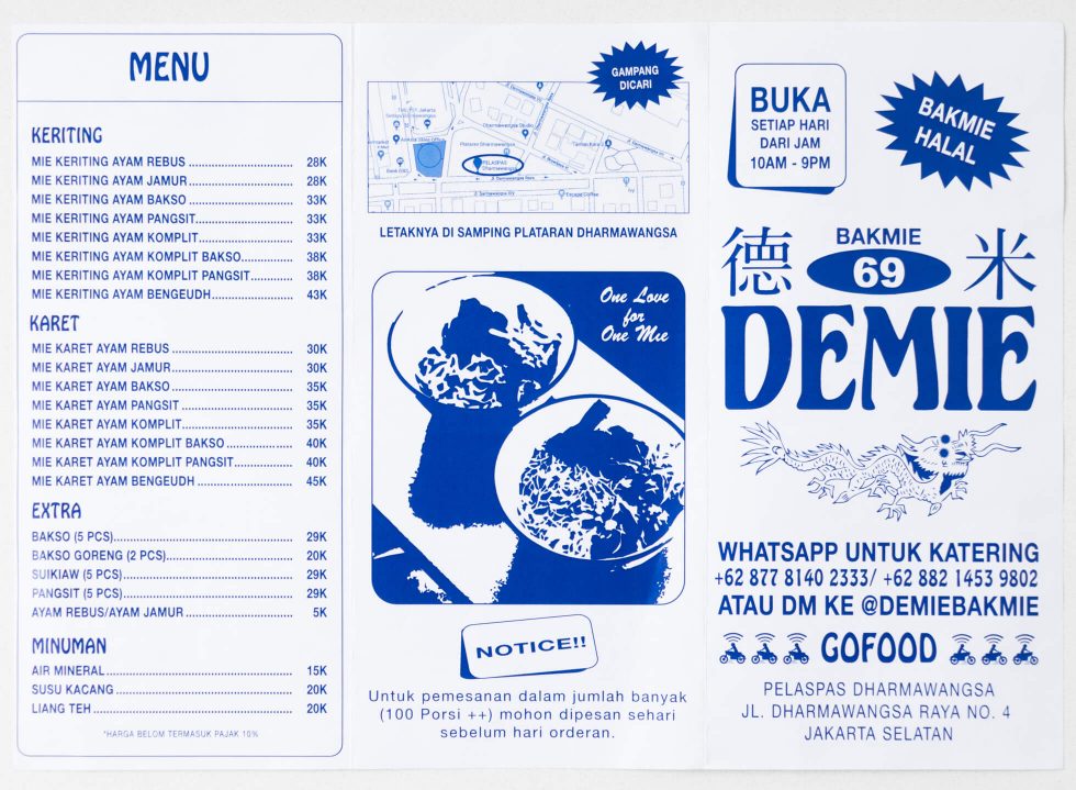
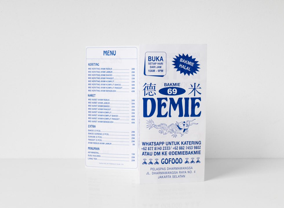
The theme is also injected into other visual elements, namely brochures and menu. The latter is a reminisce of the simple, vernacular menu employed by traditional bakmie eateries. The deliberate mis-matching reoccurs: the use of a retro typeface, this time in Hobo, coexisting alongside the classic minimalist logotype, Helvetica Neue. The influence of of western pop culture can be spotted in their takeout box, where it takes the form of classic western-style Chinese takeout box that we often see on the big screen.
Apart from the DEMIE Bakmie identity, Michael is also responsible for the design of the interior. Instead of going full Chinese route, Michael went in a different direction with a silver door that reveals a noodle bar inspired by Japanese ramen establishment. “I want to give customers a different experience [when they visit], that’s why I made the interior unpredictable and contrasting to the branding identity,” said Michael.
Still, the interior does not overshadow DEMIE’s essence as a humble noodle bar. Amusingly, if it all feels like they were carefully thought out for months, it was in fact rushed within a three-week deadline. “We were chasing a very close deadline and I wanted to ensure everything was consistent to what we want to achieve,” said Michael.
And they did just that. With various pop culture influence in the play, it’s no wonder why DEMIE Bakmie has swiftly become the go-to spot for young south Jakartans when it comes to a quick bakmie fix while reveling in the nostalgia of the traditional eateries that we commonly associate them with.