

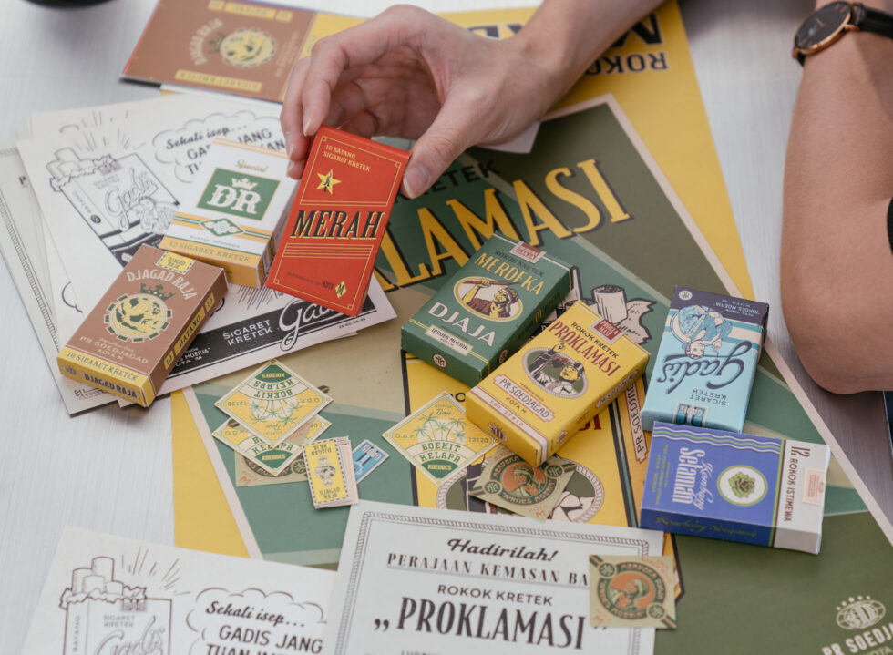
For someone who doesn’t smoke, Evan Wijaya knows a lot about cigarettes. From the weight and texture of the rolling paper, nuanced details of the packs such as the shapes and sizes that vary according to the year it was produced, to seemingly minute details like the texts on the labels and warning signs that change with time.
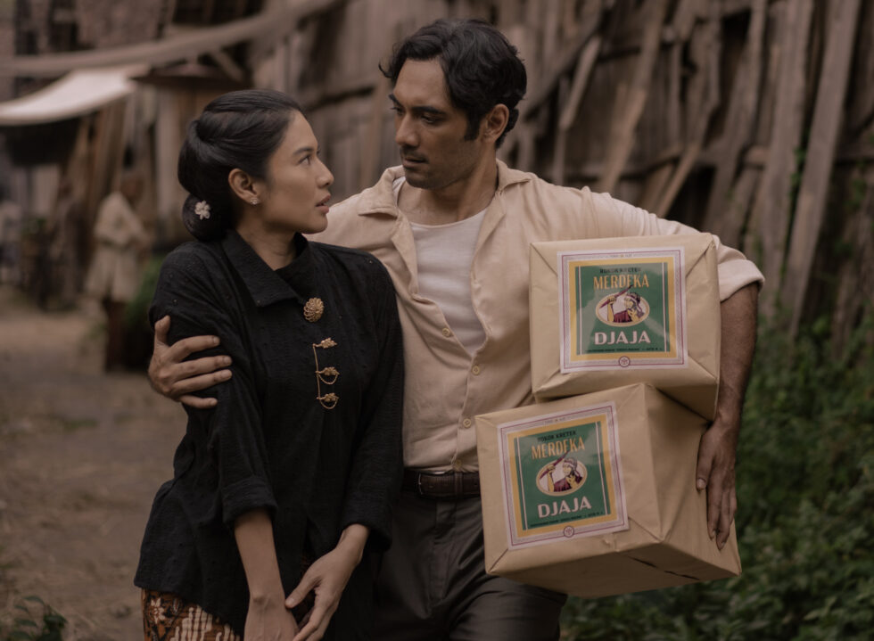
They were all part of the Semarang-based graphic designer’s research bank that he pulled from to inform his designs for the globally acclaimed Netflix series, ‘Gadis Kretek’ or ‘Cigarette Girl’ (2023). A screen adaptation of Ratih Kumala’s novel, the series tells the story of three generations of cigarette makers against the backdrop of the country’s burgeoning cigarette industry and rising political tension in 1960s Indonesia.
Across the five one-hour episodes, Evan’s cigarette packs serve as a subtle narrator, hinting at which direction the story moves without explicitly revealing the plot. The 28-year-old likens the design process to acting. “We need to understand the film’s world and characters, and come up with a particular design language that is strong enough to communicate on its own, and most importantly, has the power to drive the plot forward.”
“Although it’s a fictional world, we need to make it realistic and believable.”
This aspect of world-building is what appeals to Evan, like a magnet that continues to pull at him even from a young age. “I enjoy making something completely different from the world I’m living in now. It’s a form of escapism, in a way, to be involved in building alternative worlds and scenarios.” The Universitas Pelita Harapan (UPH) alumnus has worked under notable studios including Thinking*Room and Samara, building a portfolio of branding and identity projects before landing his first film gig and designing the official poster for ‘Cinta Pertama, Kedua & Ketiga’ (2021).
During the production of ‘Seperti Dendam, Rindu Harus Dibayar Tuntas’ (2021), Evan began experimenting with cigarette packs alongside other graphic props like labels, logos and newspaper prints spanning the ‘80s and ‘90s. The next year, he received the offer to work on the anticipated series.
Despite already being acquainted with the design language of these vintage packs, he admitted that for Gadis Kretek, extensive research was required. “Even in the novel, Ratih has positioned visual design so powerfully in her story. All the visuals are described in very great detail. It’s quite rare to see graphic design play a huge role in a film such as this, so a lot needed to go into it,” said Evan.
The process involves reading the novel and scripts and studying the set design and character costumes to collecting cigarette packs and posters of the era and examining each detail: the typefaces, layout, material, and printing techniques. “Although it’s a fictional world, we need to make it realistic and believable. So that means digitally replicating the texture, printing glitches, and paying close attention to the old spelling used during that time,” shared Evan.
“It’s so critical to get these details down accurately. It helps us immediately situate the audience in the story, space and time.”
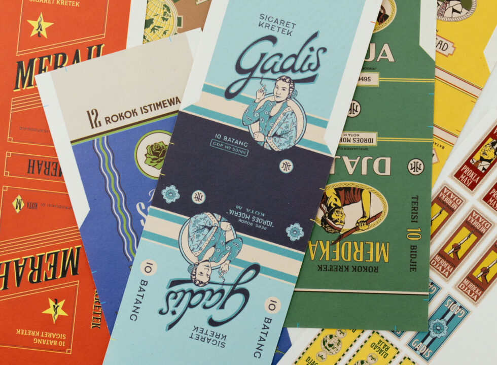
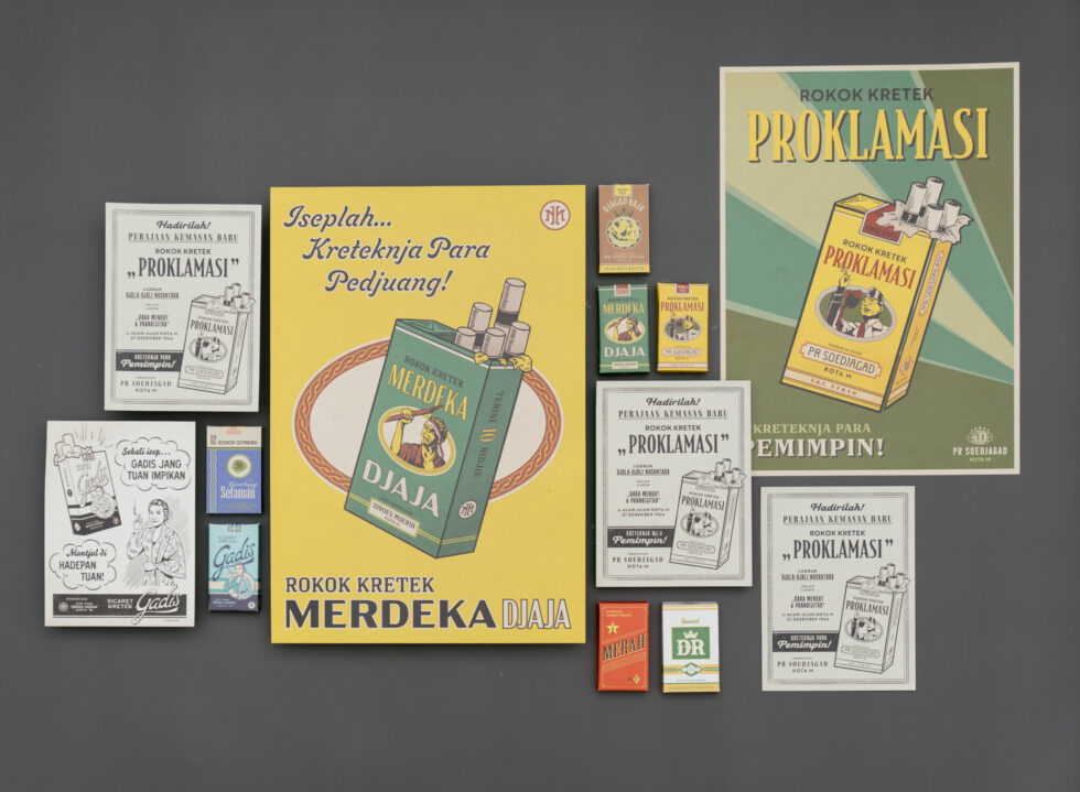
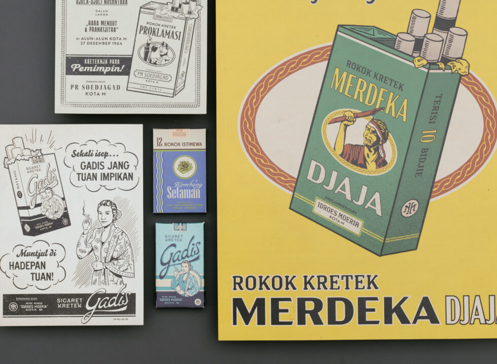
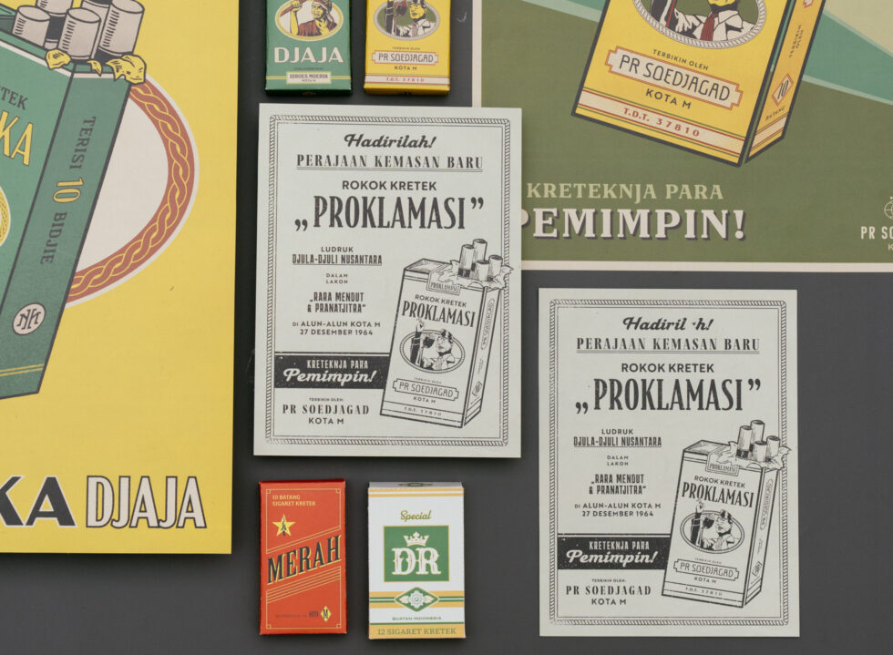
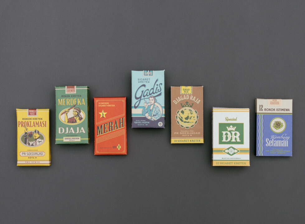
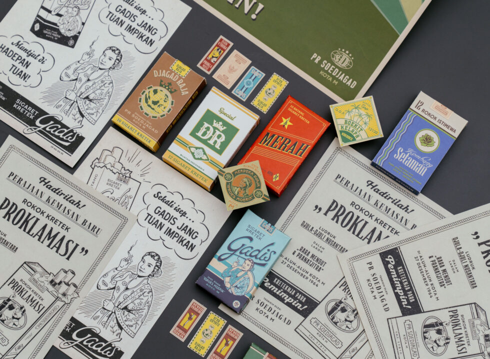
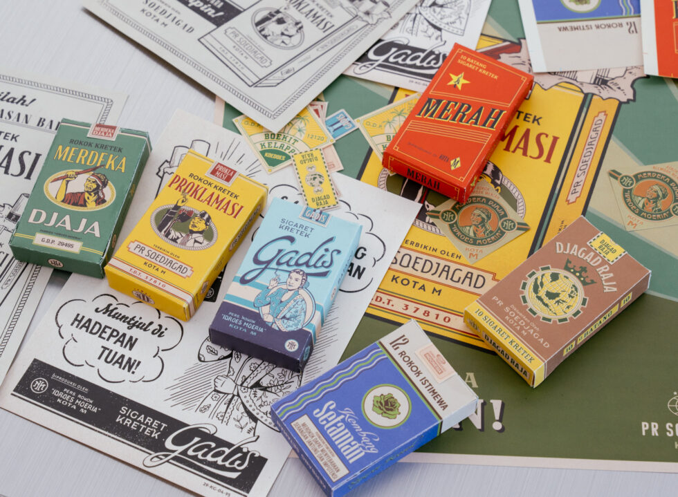
The first pack the audience was introduced to was the 2001 batch of Rokok DR, which at that point in the series, had undergone a rebranding in the ‘80s. Reflective of the era, the version arrives in a modern off-white base with moss green and saturated gold accents, an altered dimension that now fits 12 cigarettes compared to 10 of its predecessor, as well as the addition of a warning label that only recently made an appearance.
“It’s so critical to get these details down accurately. It helps us immediately situate the audience in the story, space and time in very brief frames.”
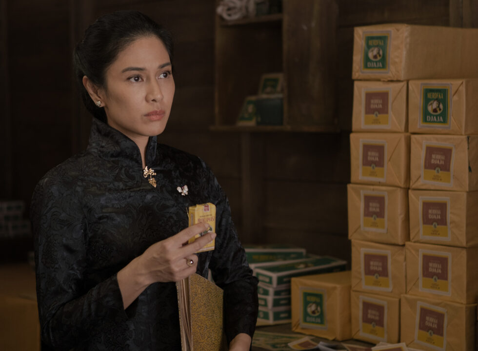
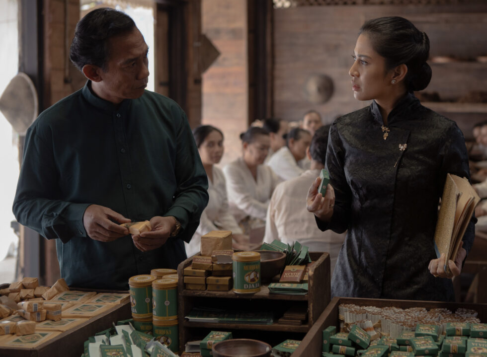
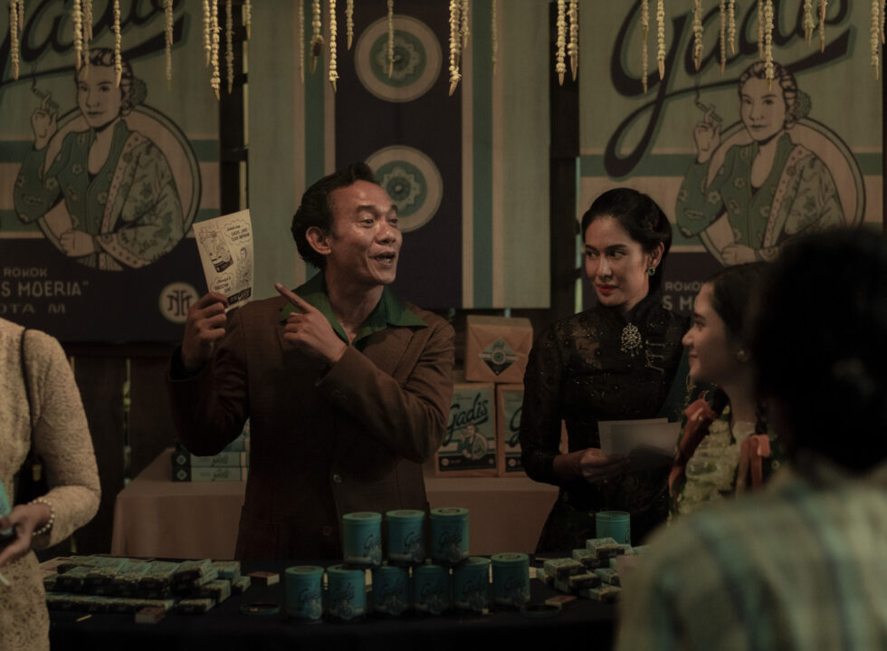
The blue-hued Kretek Gadis cigarette line—crafted by the series’ female protagonist, Dasiyah (played by Dian Sastro)—features a cursive typeface and illustration of a lady smoking, depicting a portrayal of the character the costume team developed during the early stages of filming. On the surface, the composition feels representative of Dasiyah’s grace and strong-willed personality, but peppered across the designs are also subtle elements that hint at a larger character trope.
It commemorates a time of celebration; capturing both Dasiyah’s triumph for pushing past the gender stereotype that tightly clung to that era by crafting her own cigarette ‘sauce’, as well as her upcoming nuptials with her love interest, Raja. An illustration of a mandala flower on the bottom of the side panel also nods to the door of the ‘sauce room’ where she first crafted the recipe, later revealed to be the key ingredient across Kretek Gadis, Kretek DR, and Kembang Setaman.
“The symbol is a ‘marker’ of Dasiyah, in a sense. We see it first in Kretek Gadis, then in the rebranding of Kretek DR, where Raja incorporated the emblem so that Dasiyah—who, at the time, was falsely accused of being a communist and imprisoned—would know where to find him if she was alive and came across the pack,” Evan explained.
“It’s a fascinating process, especially considering that graphic designers don’t exist during that time.”
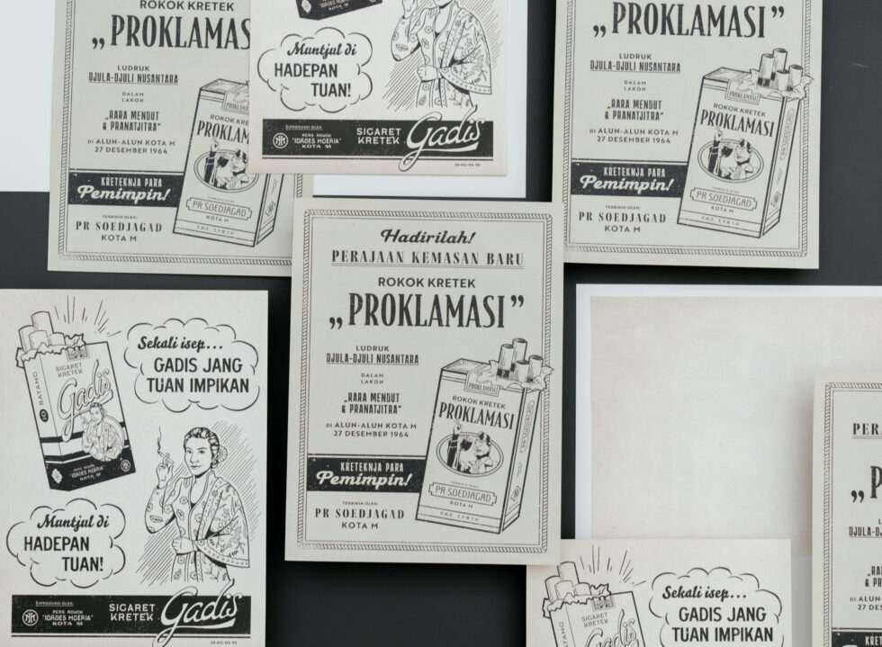
This ability to precisely capture each character’s development and story arc is an attribute that Evan has cleverly employed across his designs—to the extent that those already well acquainted with the book would still be able to find a new layer of meaning to the story. For instance, to illustrate Idroes Moeria (Dasiyah’s father) and Soedjagad’s long-standing rivalry, Evan intentionally drew similarities between their competing brands, Rokok Merdeka Djaja and Rokok Proklamasi.
“In the book, Djagad is portrayed as a very money-oriented and fast-results kind of man. I wanted the designs to immediately convey the extent to which Kretek Proklamasi imitates Kretek Merdeka Djaja, from the composition and illustration to the yellow-green colour palette. If you look closely, the packs for Kretek Proklamasi have more printing errors and ink bleeds,” Evan explained. “It’s a fascinating process, especially considering that graphic designers don’t exist during that time. So I had to get into character and comprehend why they would create something this way and not the other.”
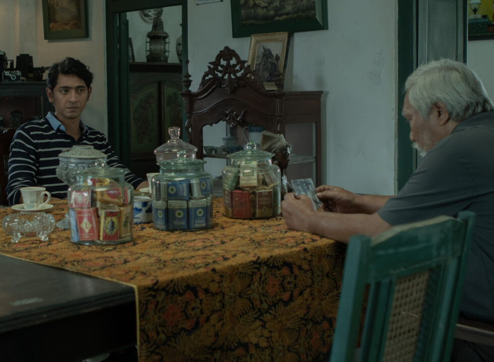
That said, not all the designs are equally loaded with cues as these packs. Some are created to blend into the background, like the posters, newspaper advertisements and handwritten labels—some of which Evan’s mother hand-wrote. That on its own is also a storytelling device. “Good visual design in film is when people don’t notice it. It seamlessly blends into the story and characters and they don’t seem out of place. To do that, the design needs to be egoless, selflessly serving the narrative and characters.”
“Everybody on set has their role. From the costume team, lighting, props and sound. Sometimes, a lot of the departments get left behind, but I hope that through projects like Gadis Kretek, people can have a heightened sense of appreciation for local cinema and also the craft behind it,” Evan concluded.