
It’s no secret that coffee shops have become a common ground (literally) for a lot of Jakartans. And in some ways, to a fault. The fleeting growth of coffee joints means the city’s third-wave coffee culture is slowly cemented, but over time leading to many offering more or less, the same concept.
Tujuhari Coffee, a coffee shop in Dharmawangsa, comes in with a concept rooted in the culture of productivity – a fresh and unusual take that is fleshed out through simple, yet memorable visual cues. In an industry where it’s getting harder to establish a distinction, Tujuhari, who opened their doors last November, shows its clear-cut uniqueness from the get-go.
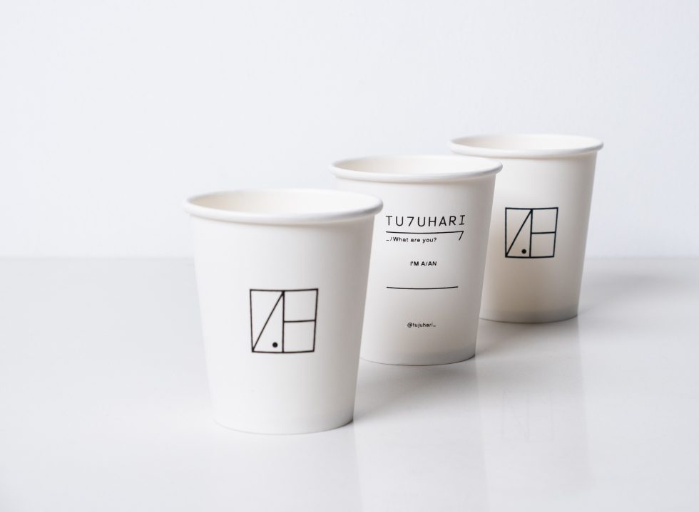
At first glance, Tujuhari boasts a fairly, straightforward logo: a square with three disjointed lines and a black dot on the bottom corner. Although the shapes look scattered and don’t seem like they complement each other, all these elements hold meanings that make up what the cafe is grounded on: modern, clean, minimalist, dynamic, productive, and cultured – all keywords the four founders Lavie Daramarezkya, Aulia Fauzansyah, Gunawan Wibisono, and Aulia Audriansyah came up with during the planning stages.
But why square in particular? “The core DNA of Tujuhari is productivity, but we are very aware of the many aspects and meanings of that term,” says Lavie. “After many painful but fun nights of iteration, we finally decided to use a neutral, simple and basic visual theme of a square. It turns out to be an easy shape; it is clear and strong and can be practised as a frame, a canvas, a table, a window, a door, a wall and so on. It also gives off a feeling that everyone is welcome to come inside it.”
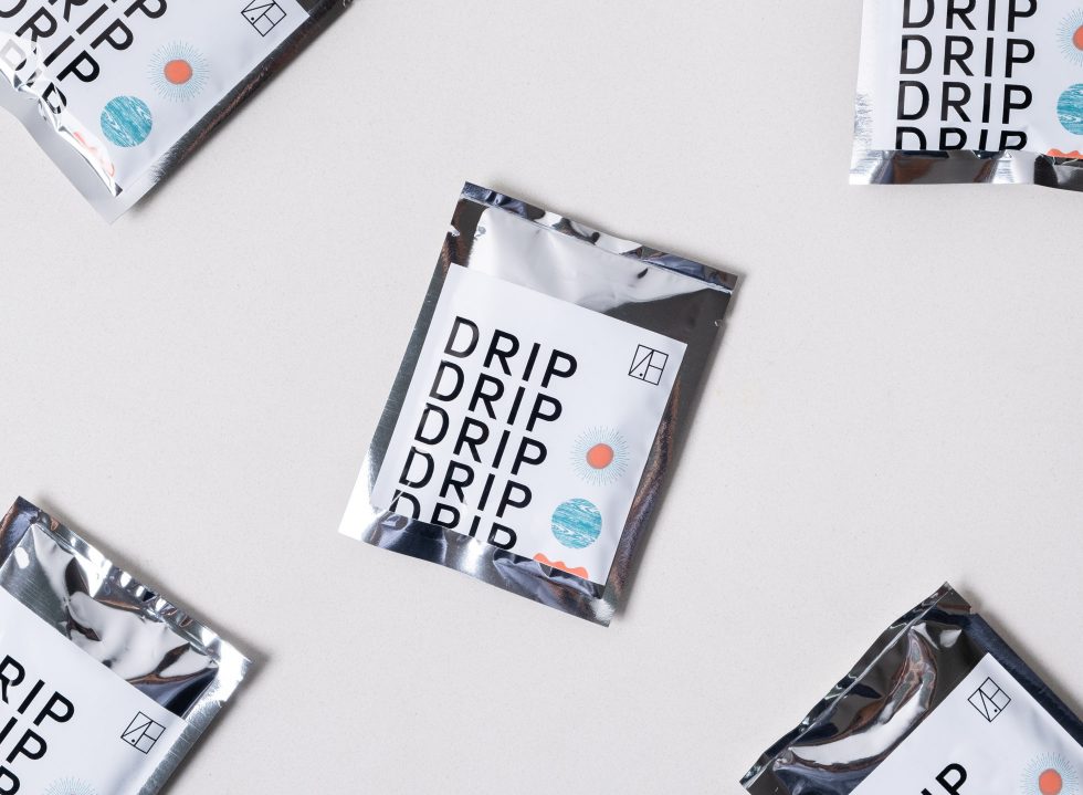
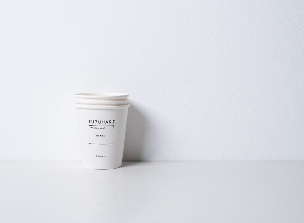
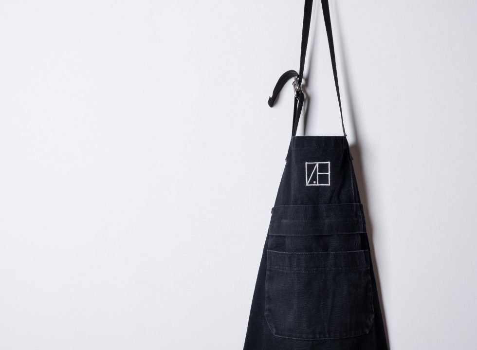
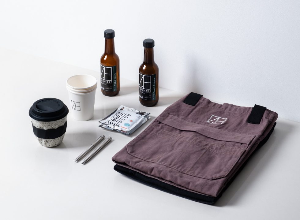
Hence the design, further realised by Jakarta-based branding design company, WorkbyW, whose recent projects include beauty brand, Rollover Reaction and audio-visual lab, Sakaspace. Today, the logo stands resolute on the cafe’s main essentials, from drinking cups, bottles, and aprons, to merchandise such as pens, notebooks and coffee drips. Naturally, it becomes Tujuhari’s most discernible visual.
At a closer look, the logo is drawn out like ‘7H’, or tujuh hari, translated as seven days. This leads one to the cafe’s logotype, which the team uses as another stand-out element of the cafe. “A simple way to introduce the distinctiveness of Tujuhari is to change the ‘J’ with ‘7’, giving a witty experience without losing the pronunciation,” says Lavie. “So, Tujuhari can easily be typeable in daily chat and also brings out the effectiveness of our main identity.”
While this may be missed by many, the linings in the logo also mischievously outline the floor plan of the cafe; with one side embracing the multi-purpose space – or ‘productivity chamber’ – and the other side for its service and counter decks.
Has it always been the intention or purely coincidental? To Lavie, it’s a mix of both. “We are trying to establish our visual-experiential design on every possible touchpoint, including our flagship store interiors,” says Lavie. This means translating every of Tujuhari’s visual elements into the cafe’s interiors, which was executed by Studio Kota Architecture.
“Not only did they [Studio Kota] incorporate the square linings [of the logo] as the floor plan, but they also gave the dot in our logo a new meaning, which is a meeting point of the people—or as they coined it ‘social condenser’.”
In the end, Tujuhari is about serving the people a space to gather, create and connect, of course with that boost of caffeinated options. Boiling down the broad term of ‘productivity’ to its essential meaning was an initial concern for the Tujuhari team, in addition to translating it to visual means. Eventually, their complete understanding and in sync-ness of what Tujuhari represents makes this one a hassle-free project.
“The approach was a minimal yet purposeful design. We are trying to build a visual brand that can be practised as a preferable meeting point for productivity. We want to be remembered as part of the progress of people’s development toward the better, that is productivity over consumption.”