In an industry where it’s getting harder to carve out a unique place in the market, Bali-based Kura Kura Beer established its individual appeal by looking inward to its island origins.
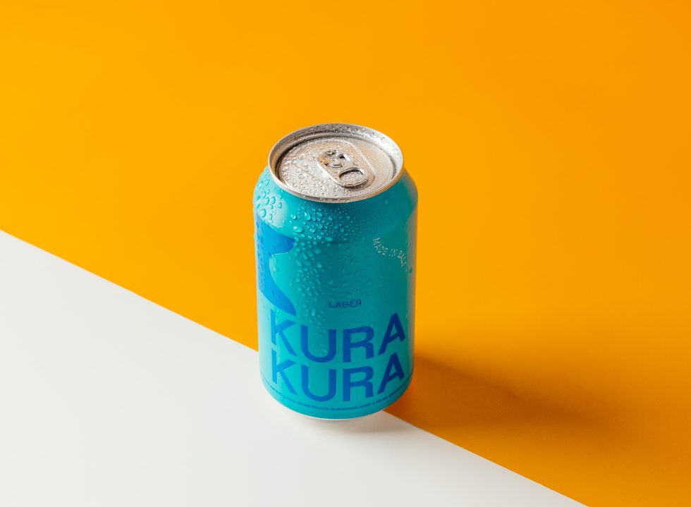
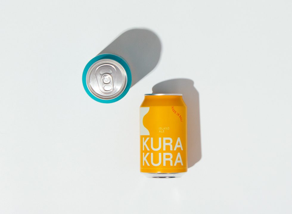
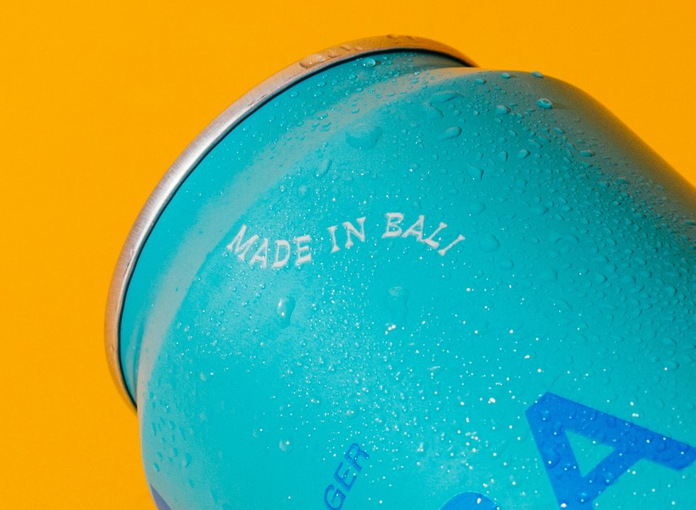
With the premise of bringing fresh, slow drinking beer to the Bali scene, and having them brewed straight from its brewery in Auman Village, Kura Kura made sure to tether its visual identity to its island provenance. Flowing through the brand’s blue and yellow cans to its digital media presence, the team at Kura Kura centres its branding and visual approach on Bali’s singularity, incorporating local details of the island’s natural beauty, deep-rooted culture and the community’s way of life.
“We wanted something that spoke freedom and relaxation. Something that remained timeless on an ever-growing island,” said creative director Sally Linsdell and brand manager Jennifer Permata. “Culture is highly respected in Bali and we wanted to build our brand on these strong foundations. We want to convey the island in a respectful, steady and approachable way.”
Going off those keywords, Kura Kura tapped the Australia-based creative agency, Swear Words, to further conceptualise the brand’s visual elements and design packaging. The idea was to capture all cues of modern Bali, and it has to pervade throughout the brand’s very being, from identity to tone of voice. After launching in June 2020, Kura Kura moved every creative content in-house, delegating the development of the brand’s visual language to its growing team of creatives.
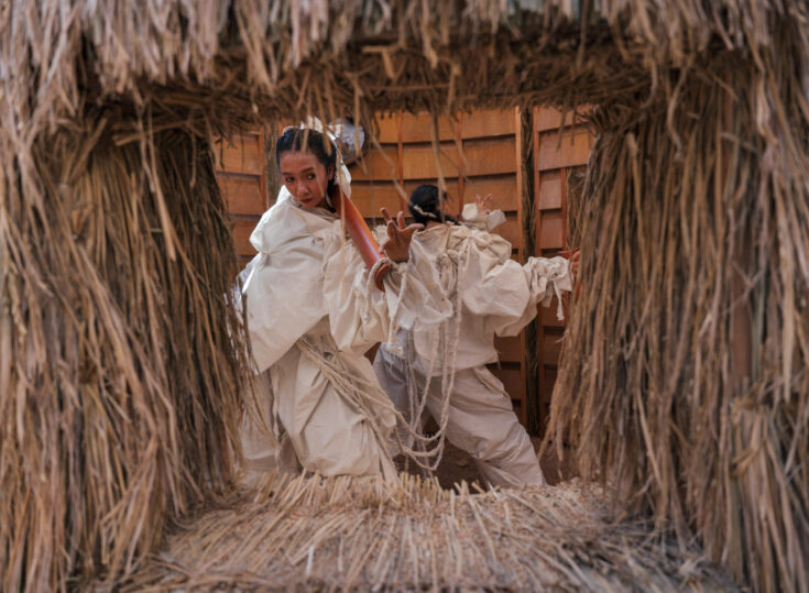
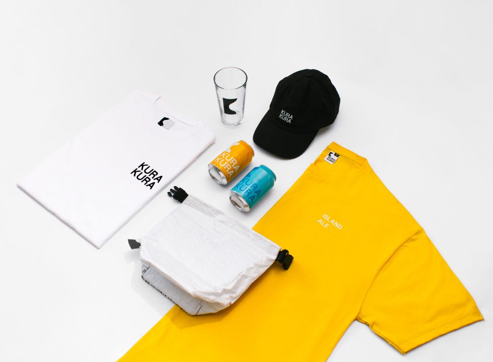
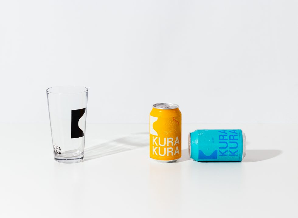
To fully capture the true spirit of Kura Kura, the creative team looked no further than to the island’s panoramas for visual references. “From Mount Agung to the beaches in Seminyak, we drew inspiration from all the landscapes in Bali.” The result is a flexible logo design that tells more than it looks, along with mainstay colours emblematic of the island, implemented across its beer packaging, pint glasses, tap badges, merchandise and other range of products. Evident throughout is a simple typography ‘Meriva’ used for all the brand’s headlines, while its curved typography ‘BB Book’ is applied to inject more personality into the overall design.
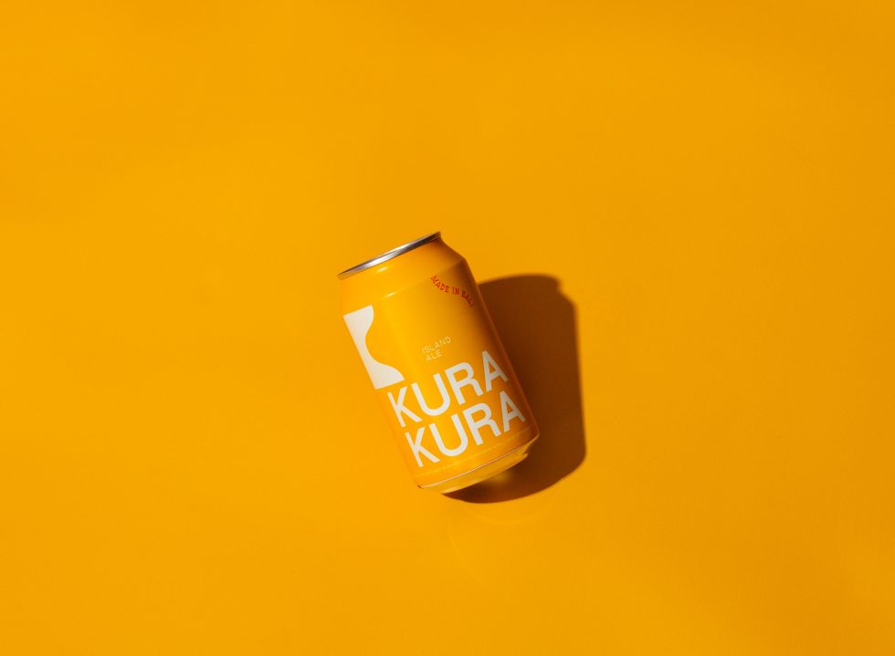
Take the logo symbol stylised as ‘K’, which not only stands for Kura Kura but also hints at a different visual element. “When you rotate it to the right, it represents Mount Batukaru [Bali’s second highest peak located near the brewery], and when you flip it upside down, it symbolises the deep crater where we source the purest mineral water—which is the most important ingredient that makes our beer tastes good.”
As many brands would agree, the right colours get your products off the shelf or moved to the online cart; Kura Kura realised this by registering an easily-recognisable palette for their signature yellow-canned Island Ale and blue-canned Lager. “Respectfully, we want these cans to remind people of the iconic sunset and the sea of Bali, too. In the future, we will be releasing new beer styles with each packaging inspired by the natural colour palette of the island.”
Outside Kura Kura’s identifiable cans, the brand also developed its identity through its range of merchandise. So far, the team has produced t-shirts in primary colours of black and white; not without purpose, these colours are inspired by the wisdom of ‘Kain Poleng’ (“the black and white checked fabric you often see wrapped around shrines or big trees in Bali”) which in Balinese Hinduism, represents the duality of good and evil and how they come to harmony.
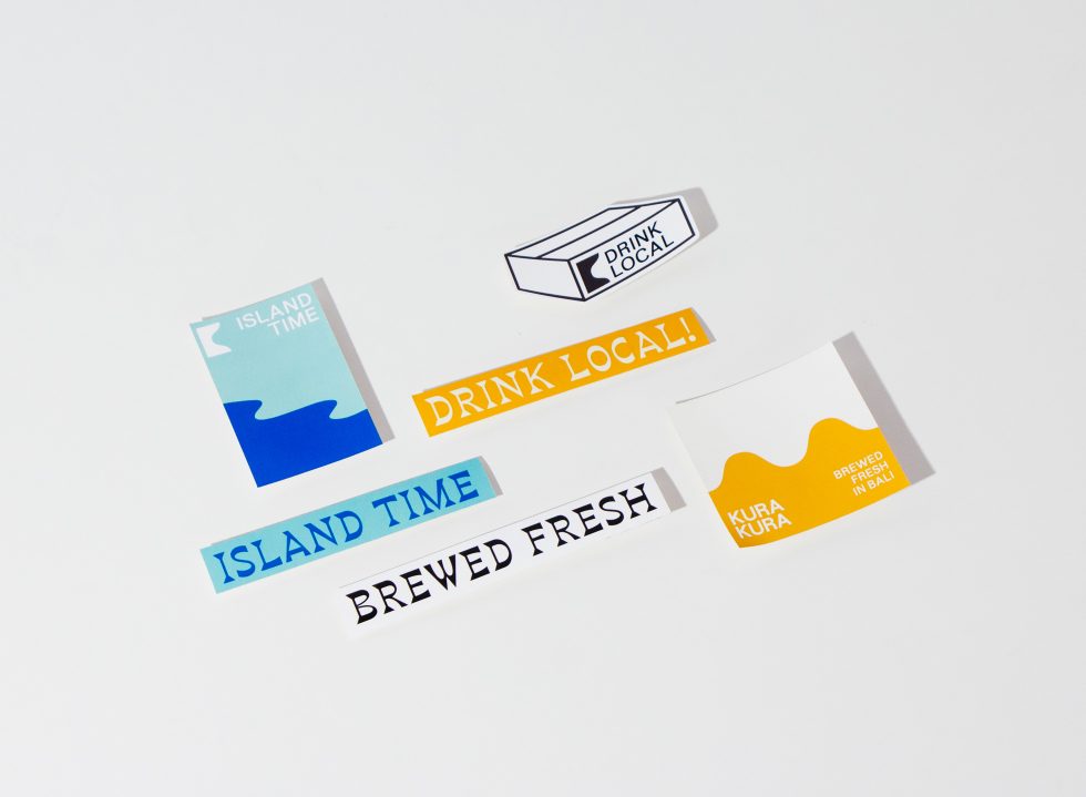
Playful stickers that reiterate the brand’s motto of “drink local” and “brewed fresh” also made it to the collection, along with a classic dad cap and an insulate to-go cooler pouch upcycled from leftover beer grain sacks.
As founder Putu Wiranatha previously stated, people want to feel connected to the brand they’re consuming. So outside its range of products, Kura Kura made sure to carry its visual identity over to its social media platform and establish a strong yet intimate digital presence to connect more with the community. Worth highlighting is the brand’s way of building a tight-knit relationship with the Balinese locals, from spotlighting local artisans and their life’s work to teaming up with homegrown brands for collaborations.
The Kura Kura team concluded: “We want to be remembered as a brand that captures all the intrinsic attitude and language of Balinese life: freedom, relaxation, escape and compassion. The kind of brand that slows down with time, with a bit of love in it.”