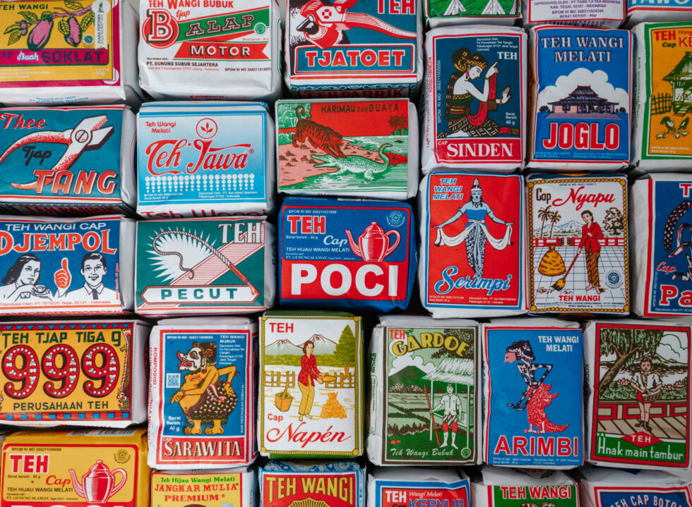
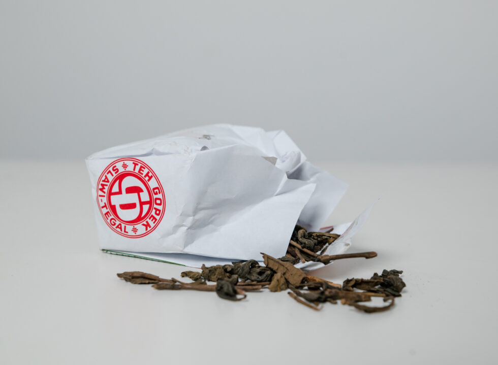
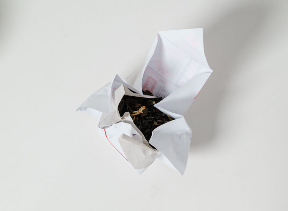
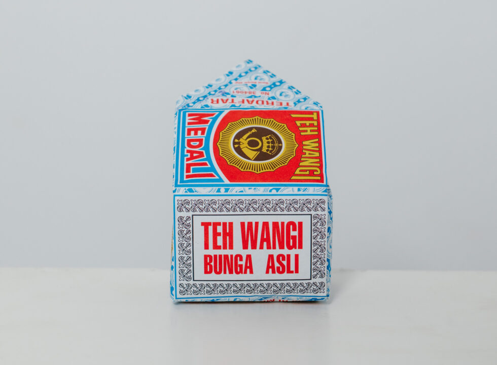
Humbly wrapped in thin paper, with colours, illustrations and typefaces that seemed to be a throw-around of various design influences, the iconic Javanese tea packaging (colloquially known as teh tubruk) stands as one of those pleasant, nostalgic finds that draw attention for being products of their time. But they also offer a unique access to Indonesia’s past (and in hindsight, a telltale of the country’s long history and quiet obsession with tea), with each design capturing an aesthetic shaped by stories, circumstances and social dynamics of the time.
Hailing from the Java tea belt (where tea in Indonesia is widely cultivated), notable tea brands like Teh Cap Nyapu, Teh Tjap Gardoe and Teh Poci came into production between 1920 and 1950. According to Dutch visual artist Mella Jaarsma, who researched Indonesia’s tea culture for her 2012 installation “Tuan-Tuan Teh (Lords of the Tea)”, most tea was produced from Dutch-run plantations. They were then packaged and distributed by ethnic Chinese merchants.
“These tea packaging are a clear reflection of their colonial past and the parties involved,” said the Yogyakarta-based artist, who specifically collected tea labels from various villages around Java for her embroidery installation that was recently showcased at Art Jakarta 2023. “Only after Indonesia gained independence did these factories become state properties, [leading the way] for local cultures to be reflected in these tea designs, [with inclusion] such as batik and wayang figures.”
Also observed by Adityo B. Hardoyo, a fine arts graduate from Bandung Institute of Technology in his research paper ‘Desain Vernakuler Pada Media Kemasan Teh Seduh’, these tea packaging were designed “before there was refinement of Bahasa Indonesia spelling, and before offset printing was widespread in the country. These visuals are still maintained today [by the respective companies] because their brand image and packaging have long stayed close in the perception of the general public.”
“These tea packaging are a clear reflection of their colonial past and the parties involved,” – Mella Jaarsma, Dutch visual artist.
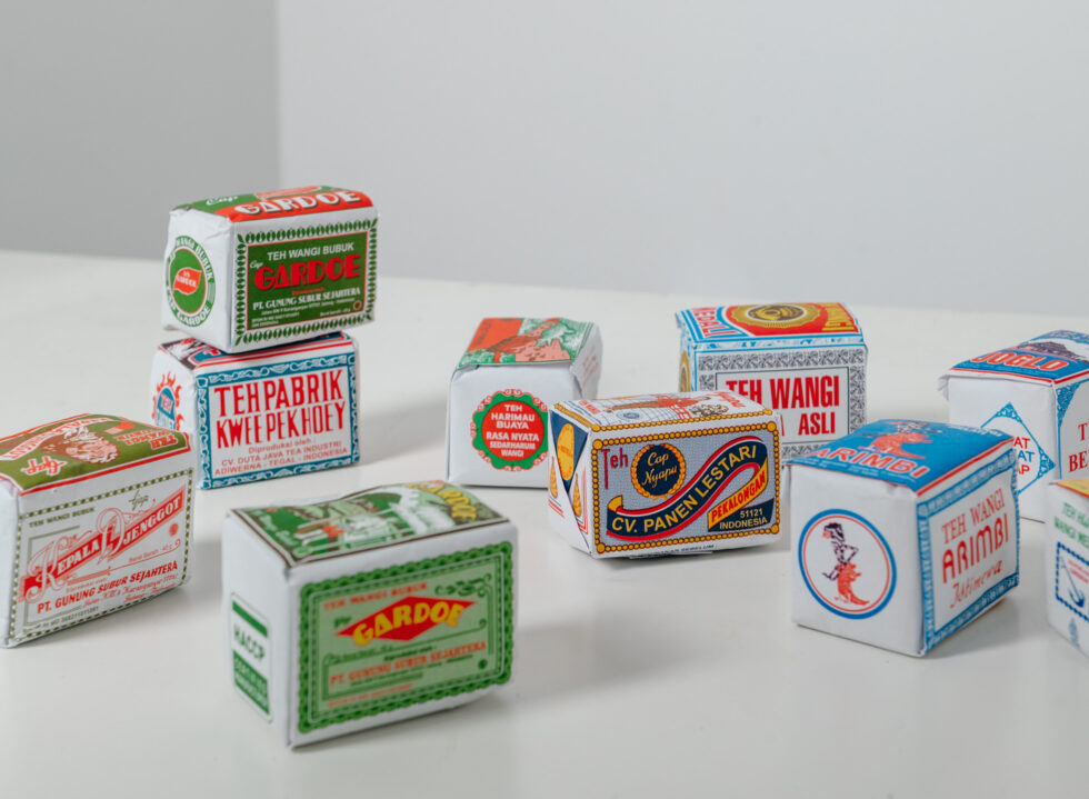
Scenes of verdant rice fields and hilly mountains are notably illustrated in Teh Tjap Gardoe, a local tea blend produced since 1930 by Teh Gunung Subur in Surakarta. Standing against the scenery is a man holding a sharp red bamboo as he stands guard in front of a post station, wearing a batik waist sash. According to Hardoyo, this suggests tea drinking as a leisure activity that farmers would do in between their day-to-day labour; in the same periphery, the visual may also indicate a sense of turmoil, a hint at the socio-political undercurrent of the time.
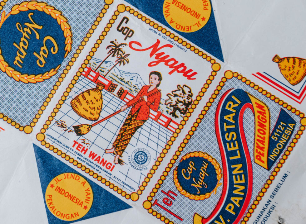
In Teh Cap Nyapu, a woman wearing a traditional kebaya and batik parang skirt is seen sweeping her backyard against a mountainous backdrop, another call to Indonesia’s natural landscape. Incorporating a mix of sans serif and script letter forms, there are also features like the yellow ornamental bordering that is characteristic of the Victorian style, a design style developed in Great Britain during the reign of Queen Victoria (1837-1901), as described by Ayu Latifah in her research paper “Kajian Visual Kemasan Teh Tubruk Lokal” for Institut Seni Indonesia Yogyakarta (ISI).
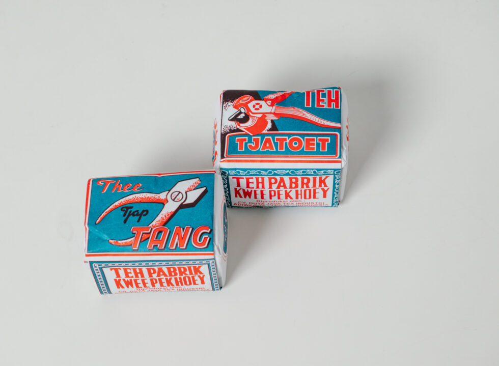
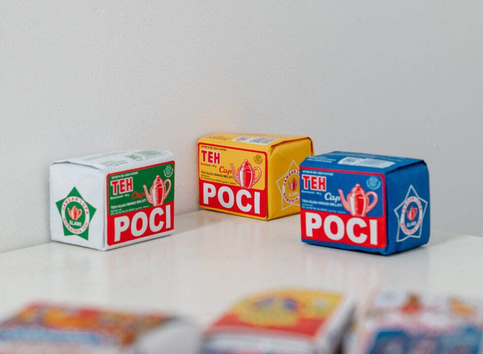
Traces of Dutch and Chinese influences are also showcased through illustrations of everyday objects and colours. The use of red, blue and yellow in the titles and illustrations for tea brands like Teh Poci echoes a clear influence of Chinese culture that considers them as lucky colours. Whereas objects like European tea cups, or most notably, an illustration of a European man donning a tuxedo as if he were attending a gala or tea party portrayed in Teh Tjap Kepala Djenggot, is traceable to the country’s Dutch East Indies’ roots.
“We found a big range of visuals when we collected these tea labels,” said Claudia Novreica, co-founder of Grafis Nusantara, a platform that archives vintage Indonesian labels and stickers. “Some of them are what we consider ‘maximalist’, with full-fledged illustrations that have more than three colours, which is quite rare for small tea producers in Indonesia due to economic factors back then. But some other tea labels have a more decorative look; there might have been influences from the Art Deco style with their use of geometric shapes and stylistic fonts.”
“We found a big range of visuals when we collected these tea labels,” – Claudia Novreica, co-founder of Grafis Nusantara.
One distinctive element that Claudia continues to find in Javanese tea labels—and by extension vintage brand design in Indonesia—is that they don’t rely heavily on symbols. “Instead, they incorporate everyday objects, people, and activities into their branding. Some even delve into the spiritual realm by incorporating lucky numbers.”
A label that particularly appeals to her is Teh Cap Potret, a local tea blend from Gandasoli in West Java, that features a photo of the late founder, Cucun Sabehi, framed in red with stylistic bordering.
“This shows how old-school brands boldly put their owner’s picture in their branding, thinking they were well-known in their community,” pondered Claudia. “As we fast forward to the present day, we find ourselves disconnected from the context surrounding the individual, and we can’t help but wonder who this person might have been. Perhaps he was a local legend, a figure whose life and deeds were woven into the fabric of their community. Or maybe, he was a trailblazer, a visionary entrepreneur who left an indelible mark on the world of tea.”
One might argue if these packaging are still considered ‘good design’ today, for their effectiveness might be limited to the specific audience and time they exist in. These designs also encompass much broader and complex cultural nuances that can’t be narrowed down to a specific genre. But this reflection on past designs still begets curiosity, as they continue to serve as a source of ideas for various materials and techniques that are still worth exploring.
“Designers now learn from the past and look for ‘alternative’ ways to create. Like book designers printing with stencil technique, for example, in which limited colours are an issue again, but they actually contribute to the aesthetics,” opined Mella. “Every material or technique becomes a specific choice and they become their own strength.”