
In a heavily competitive industry like F&B, the pursuit of a standout identity can all too often be misinterpreted as a need for excessive design and frilly decorations. Fortunately for us, ECAPS recognises this isn’t the case. The name, an anagram for space, hints at their mission to be an establishment that couples functionality and space, aiming further beyond the boundaries of ‘just another coffee shop’. So, instead of developing a visual identity that is loud on the surface, they favoured a cleaner, more modern approach, allowing what they stand for to do all the talking.
Despite being relatively new on the block, they have captured the hearts of South Jakartans with their notion of sustainability and green-living — signified through their wholesome approach to repurpose waste materials and source quality ingredients— which resonates with many who strive to adopt this mindful lifestyle despite the challenges of living in the city.
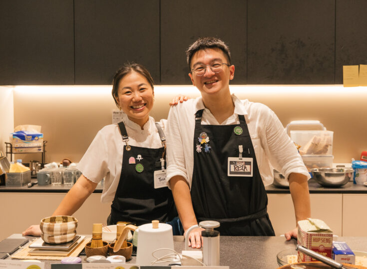
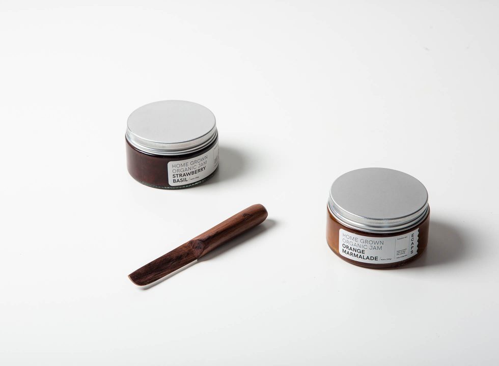
In ECAPS, less is more. People don’t come here for elaborate ambience or fancy dishes. Rather, they’re here because of the brand’s genuine takes on their offerings and how they were made. “We wanted to keep the design stripped back and very minimal as a nod to the foundational concept, which is actually good food and good sources, as simple as that,” says Audrey Bernanda, one of the co-founders. Here, pasta and bread are made from scratch and fresh herbs are handpicked out of their mini garden.
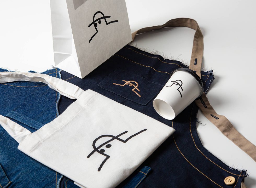
With this in mind, they tapped the aid of Jakarta-based graphic designer Aditya Wijanarko to come up with a simple yet strong design that solidifies ideas true to the establishment’s value. Having had experience in multiple design projects, including working on the branding for Indonesia’s Frankfurt Book fair in 2016, he’s had time to develop his distinct output of fluid lines and playful illustrations, which naturally manifested to “Cap,” the wholesome visual identity and iconic mascot of ECAPS.
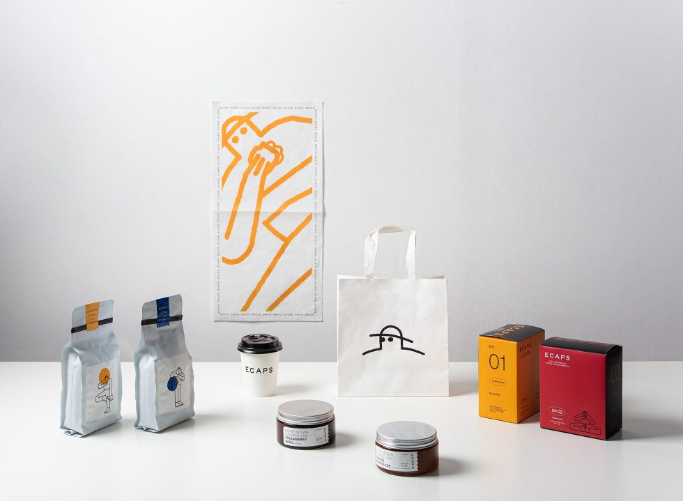
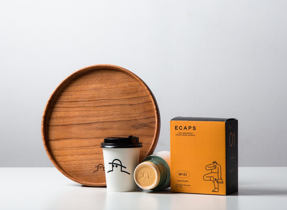
Displayed across multiple surfaces in a monoline style, illustrations of Cap narrates his day-to-day life as an urban farmer. For instance, on one of the coffee drip packaging he’s holding a yoga pose while simultaneously sipping a cup of coffee and watering his plants, on another he’s hugging a plant. “Everything in ECAPS traces back to Cap,” Audrey explained. In a nutshell, everything in ECAPS, from coffee, to herbs and produce are all the fruits of Cap’s labour.
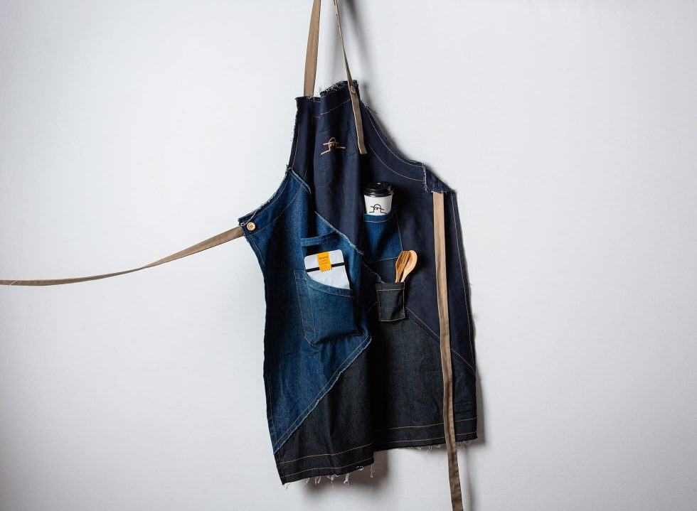
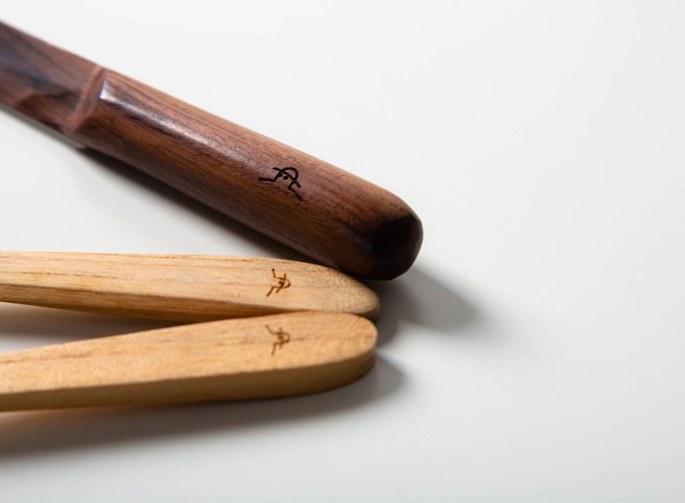
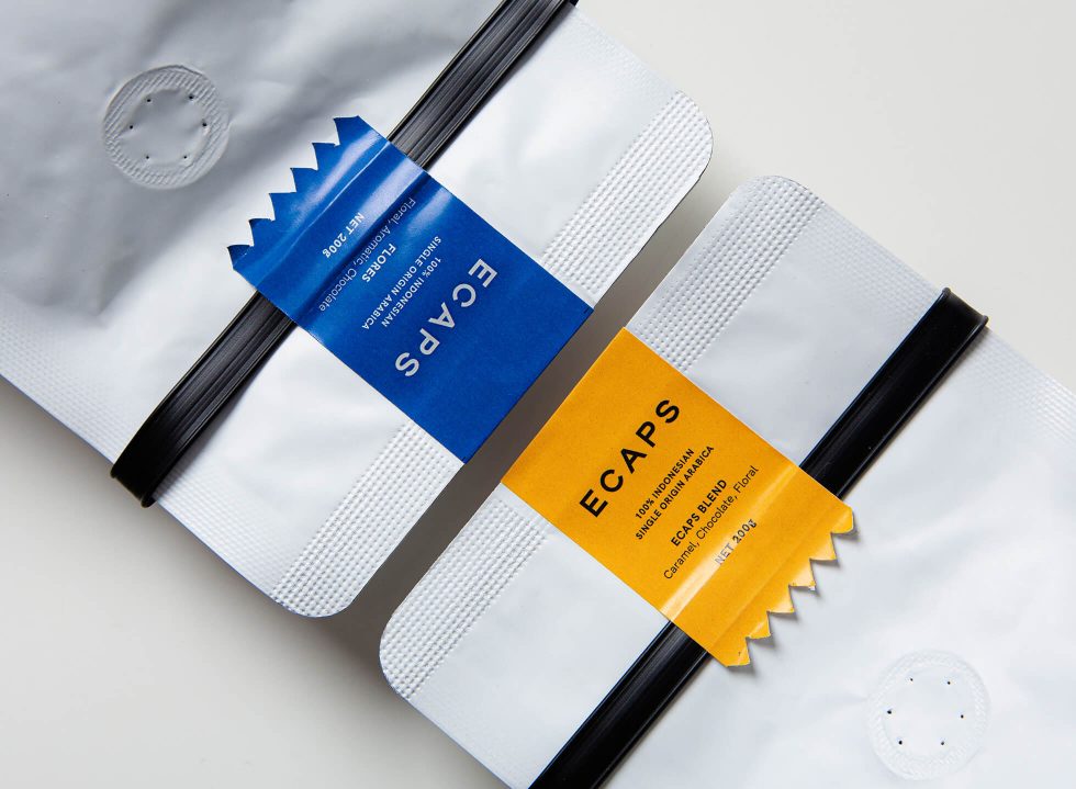
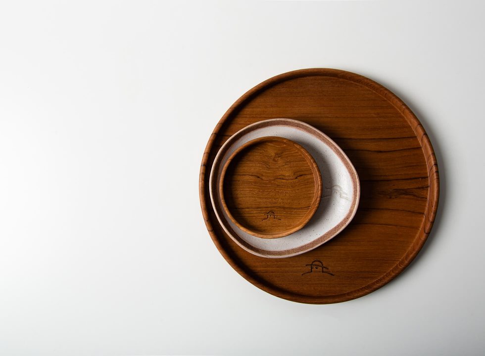
This stripped-back approach echoes across their collaterals: coffee packaging, tote bags, and even jars of homemade jam to tableware, mugs and plates, all bearing variations of Cap against a backdrop of neutral hues and solid blocks of yellow, blue, and red. As for the logotype, it was intentionally kept as ‘ordinary’ as possible. “We considered Arial at one point, but ended up going ahead with HK Grotesk. We wanted it to represent the inclusivity of the space, that it’s open for everyone,” shared Aditya.
The designs aim to mirror this concept, further narrowed into these three words: minimal, basic, and essential—the keywords shared with Aditya during the initial design stages. “We were on the same page, in that we intended for the design’s clean and minimalist approach to encourage bigger things to shine,” the designer explained. And in this case, it prioritises the “good food, good source” transparency and full-circle vision embraced by the founders.
Indeed, community and collaboration remains at the heart of ECAPS, and their interior speaks true of this. Dotted across the room, the chairs and tables by Studio Hand are crafted from recycled bottle caps, floors are pieced together using marble waste courtesy of their friendly neighbour, Magran Living, while the concrete walls are meshed with cigarette butts to form perfectly imperfect specks of defects. Talk about a complete transformation.
The founders resist the idea that big gestures equals big change. On the contrary, the whole initiative of ECAPS is driven by the belief that small steps, when taken together, have more power to catalyse change, and they hope that the design and concept of ECAPS will help prompt visitors to consider the possibilities of adopting a more conscious lifestyle that will transform their relationship with food and the environment.
“Life in the city is so fast-paced, but people are slowly making lifestyle changes. We hope that ECAPS will start a dialogue and be a part of this positive change,” Audrey concluded.