There’s an ongoing inclination for the humble oldies in Jakarta’s F&B industry, and Chinese food is holding that torch. Especially in South Jakarta, the idea of nostalgia has caught on like a fever, where the current hearts are irrevocably attracted to visual and identity concepts that scream ‘jadul’. And with unapologetically millennial spins applied to old-fashioned concepts, ‘jadul’ rhymes with cool. Coincidence? You be the judge.
But joking aside, Bubur Cap Tiger is among the very young and recent establishments that have successfully established a characteristically oldie persona by having a strong visual identity that communicates it. The eatery serves nothing novel: delish Chinese rice porridge with toppings and garnishes. With the right strategies and packaged with the right visuals, it has become an instant hit among South Jakartans since its opening in April 2019.
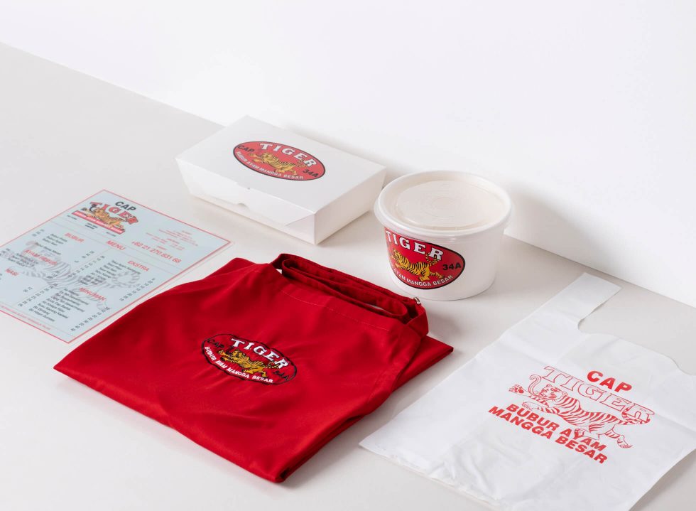
“The vision was to create a humble food place because for the longest time, restaurants in Jakarta have been trying to up one another by being so sophisticated and upscale. At some point, I believe it got too tiring,” says John Darmawan, owner of Bubur Cap Tiger. With branding designer Michael Killian, Josh set off to create Bubur Cap Tiger that’s currently sitting on Cikajang street. The keywords: humble, bold and grounded.
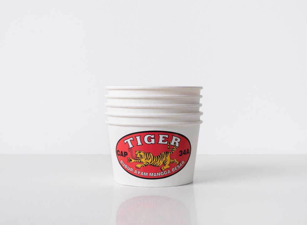
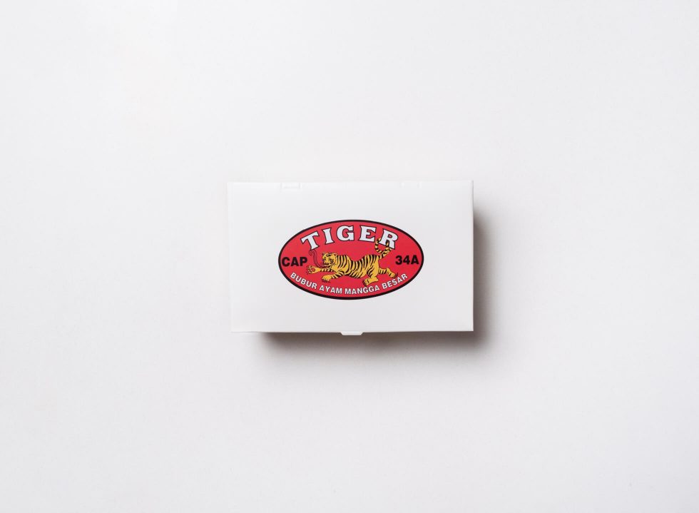
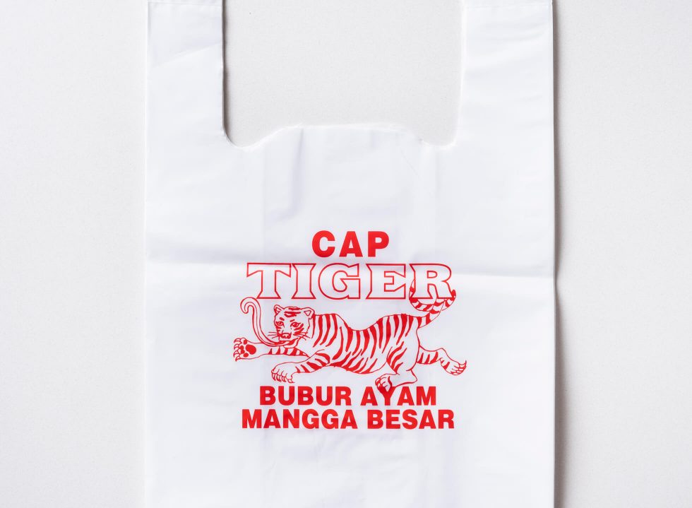
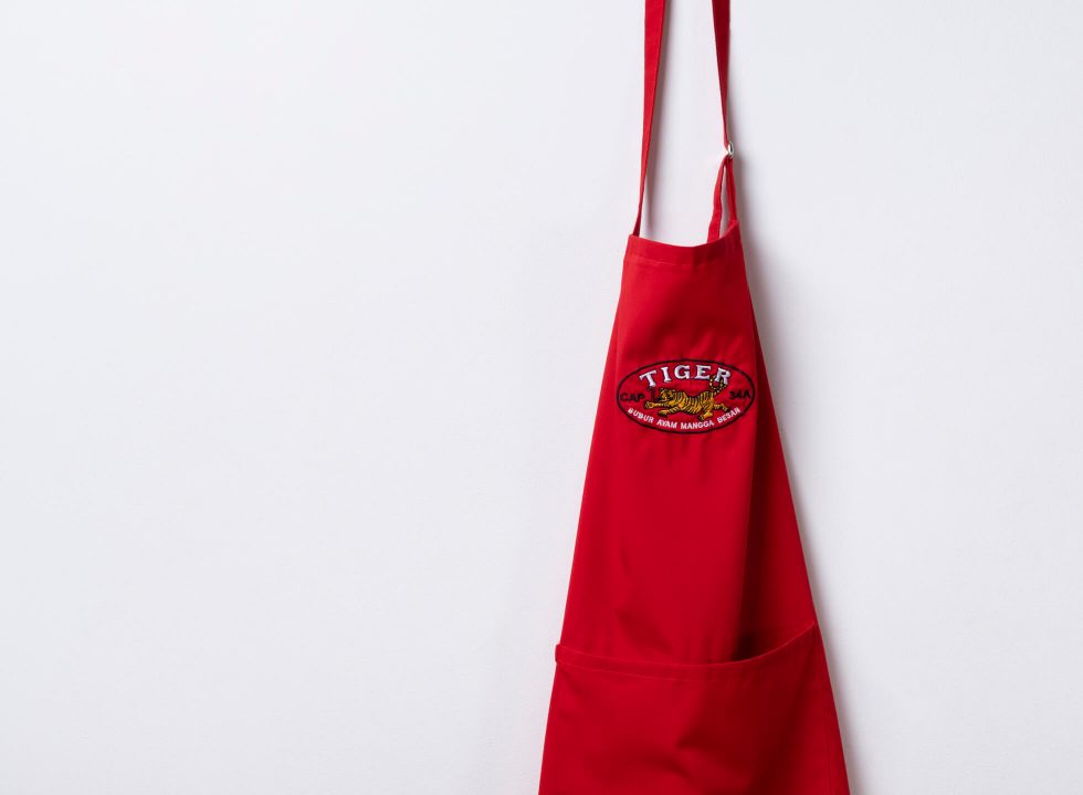
To represent the food’s Chinese origins, the tiger became the mascot of choice. “The tiger is a very Chinese animal, just like the dragon. But we went with [the tiger] because it’s a land animal, thus grounded,” explains John. But even the process of getting the tiger right for John required extra attention to details. “The tiger’s ‘ugly’ face is actually deliberate, I wanted that and Michael delivered a few options until we got this face you see on our logo.”
What may come across as a lack-of-skill aesthetic is actually a very true and real design style, we know it as vernacular design. In broad terms, vernacular is a style born from commoners whose skills (or lack thereof) yield very simple and modest as-it-is artworks that fulfill the purpose in all simplicity. The team relied on this specific style design to achieve Bubur’s visual identity.
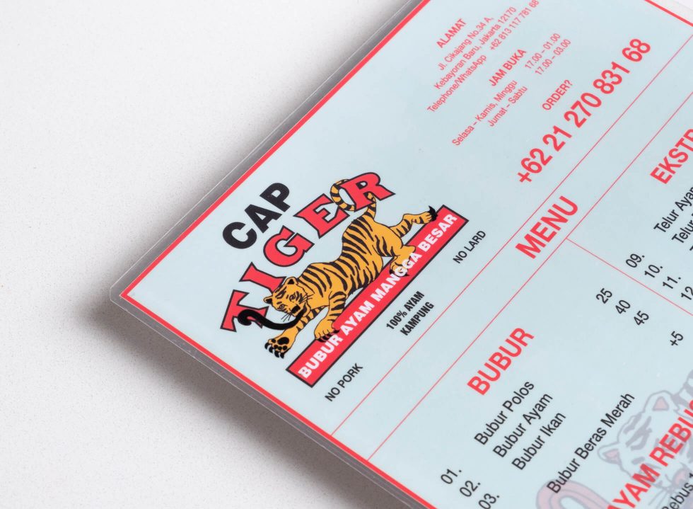
The strike of nostalgia comes from yet other visual cues found in the logo. First off, its spelled out name, Cap Tiger, typed out in a mix of serif and sans-serif typefaces, is a nod to an archetypal Chinese-Indonesian old diction to brand a product or good. Cap Lang, Cap Kakitiga, Cap Badak are among the many you will find.
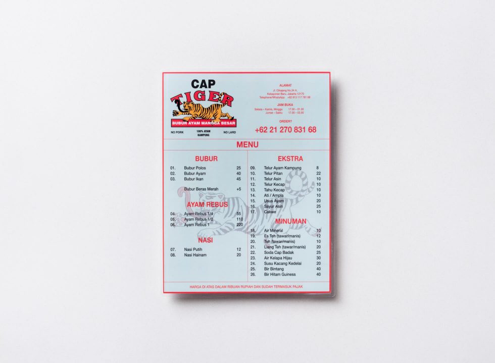
Then, the colour–a raw red– is yet again a reference to the good luck significance in Chinese tradition and further inspired by the colour scheme of a Hong Kong movie by Wong Kar-Wai, In the Mood for Love (2000), as pointed by Josh. On Bubur Cap Tiger’s menu, these visuals are dropped against an unmistakably salted-egg teal hue for that millennial spin.
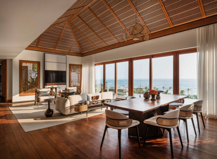
But John reiterates: strong branding in the F&B industry is the product of a harmonious visual identity and interior design. Bubur Cap Tiger shares its Chinese DNA by replicating the true ambiance of Pecinan (Chinatown) within its walls. The eatery, designed by Rafael Miranti, is a compact place with communal tables as seen in eateries on Glodok’s tight alleyways; bringing in the authentic chaotic vibes and closeness of a revered Chinatown eatery to South Jakarta.