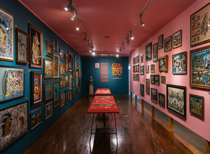
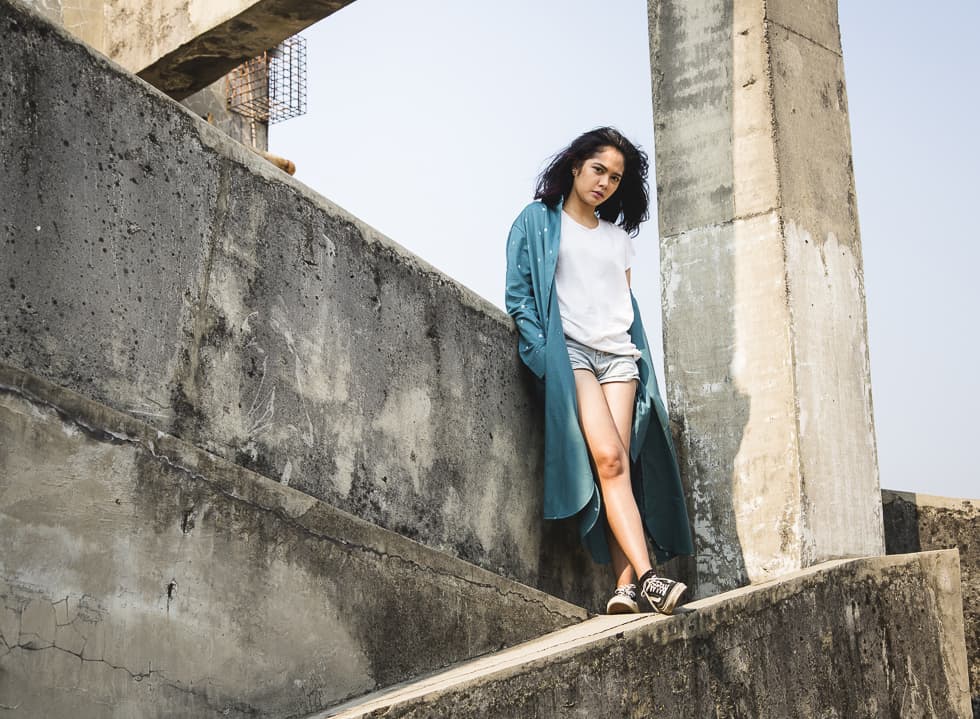
‘PLASTIC’, an art exhibition initiated by local streetwear label, Monstore, is aimed at uncovering new talents as well as providing a platform for the local young artists to voice out their ideas. Following a submission process, local artists around Indonesia were invited to interpret their own take on the exhibition’s theme, ‘PLASTIC’. And 25 of them were chosen to participate within the art show in ARTOTEL, a boutique hotel in Central Jakarta, for a period of five weeks from September 4th until October 15th, 2015.
During the launch of the exhibition, we got the chance to speak to five of the 25 artists to uncover their intentions and delve deeper into their thought process behind their artworks.
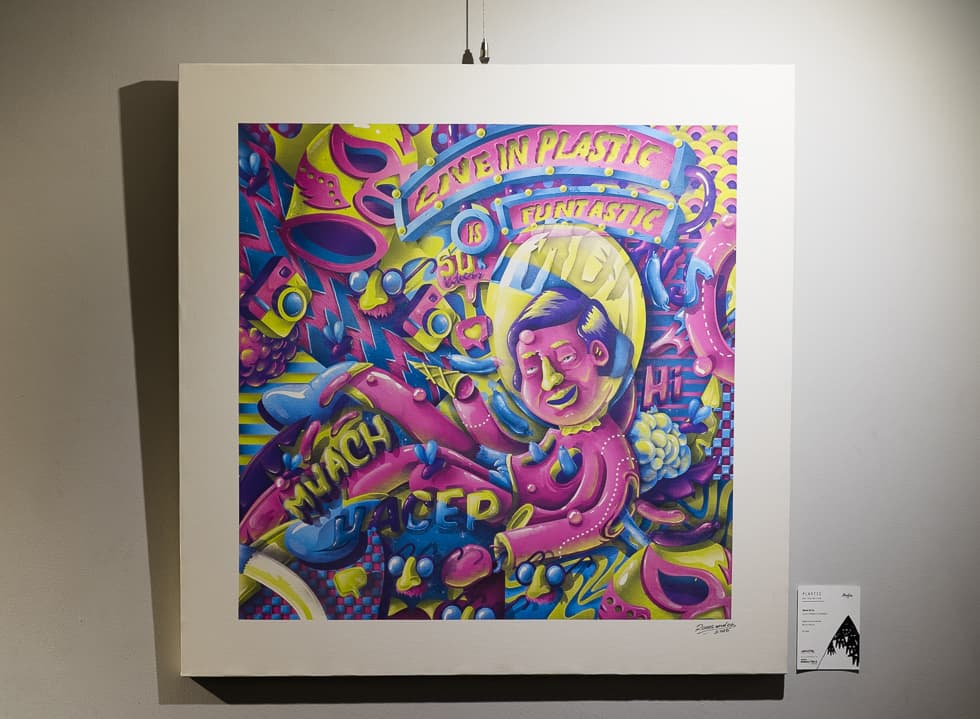
Roots & Co. (Gerson Gilrandy, Melfri Gazza & Oscar Sihite)
Artwork Title: “Live in Plastic is Funtastic”
You titled your artwork ‘Live in Plastic is Funtastic’. Does the title allude to Aqua’s Barbie Girl?
Yes it is. We’re inspired by the 90’s. It is related to Barbie Girl’s lyrics, “I’m a Barbie Girl… Life in plastic, it’s fantastic.” The lyric actually means “I want to be like Barbie because she can be pretty forever, and also lives forever.” It’s identity crisis. That’s what we want to counteract in our artwork, because we think identity crisis is pathetic.
Tell us more about your artwork. How does the idea of ‘PLASTIC’ inspire you?
In our artwork we have a character that’s falling and drifting into a complex situation where everything is all jumbled up and ambiguous. We don’t confer a certain gender on the character, as you can see. It’s actually relate much to youth on this era; they want people to see them as someone who is perfect. So they’ve been trying so hard to make themselves perfect, but actually, they’re not [perfect].
This art is a criticism towards our era – how people are trapped and influenced by the social media, current fashion, and those things that make them think, “I have to do this and that to be gokil (cool). I have to get plenty [Instagram & Facebook] likes.” We gave a twist in using ‘funtastic’ instead of ‘fantastic’ to further tease the idea.
Can you explain to us the components of your artwork and how they relate to your vision?
There are so many elements here. We use crazy and vibrant colours and patterns as well, which reflect the ‘identity crisis’ state the youth has been living in now. They also reflect our restless social lives.
If you notice, the character (in the artwork) covers the face with a see-through balloon, because he/she feels insecure. He/she wants to be pretty, handsome, to become whoever people are telling him/her to. We put a smile onto him/her. But it’s actually fake.
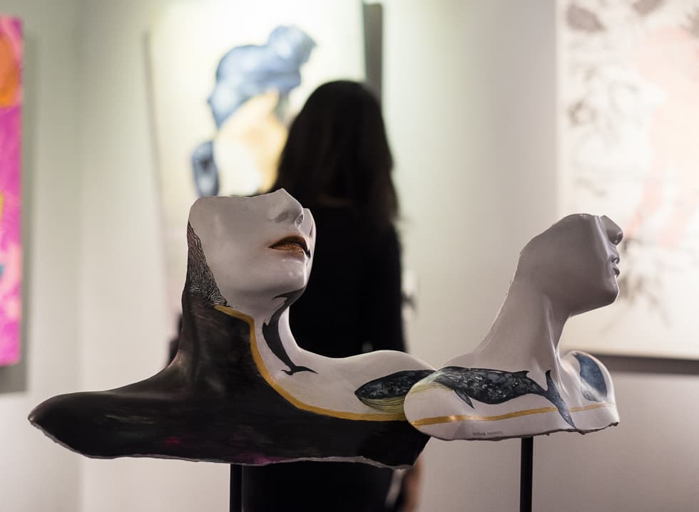
Hilma Sophia
Artwork Title: “Visual Idea of Persona”
What does ‘PLASTIC’ mean to you and how does your art inspired by it?
Unlike many others, ‘PLASTIC’ is not a negative thing to me. It is our way of showing different sides of our personality in order to adapt to our surroundings. From the way we speak to our parents to the way we speak to our friends, what we eventually choose to show the world is the personal product of our own curation.
You are showcasing two masks in this exhibition. Can you walk us through your thoughts and process behind your artwork?
I created both masks based on my own face and decorated to what I’ve found after exploring myself. The orca whale is my spirit animal, that’s why there’s a variation of whales all over [the masks]. I used resin, acrylic paint and some finishing on the final product. But the initial negative mold was made of plaster (gypsum), in which then the positive mold was made and repeated thrice to end up like this.
Has this project taken you far from your regular style?
I love sculpture and mixing media. A lot of my work has consistently discussed the topic of ‘inner-self’, so I feel that the theme of ‘PLASTIC’ suits the message that I’ve been trying to get across so far.
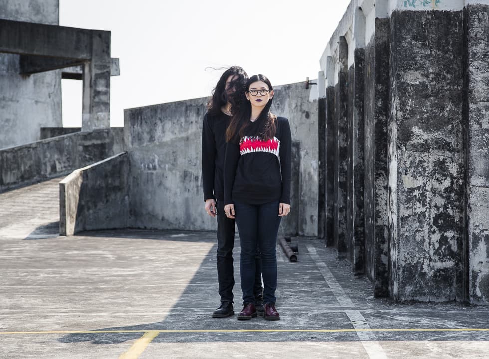
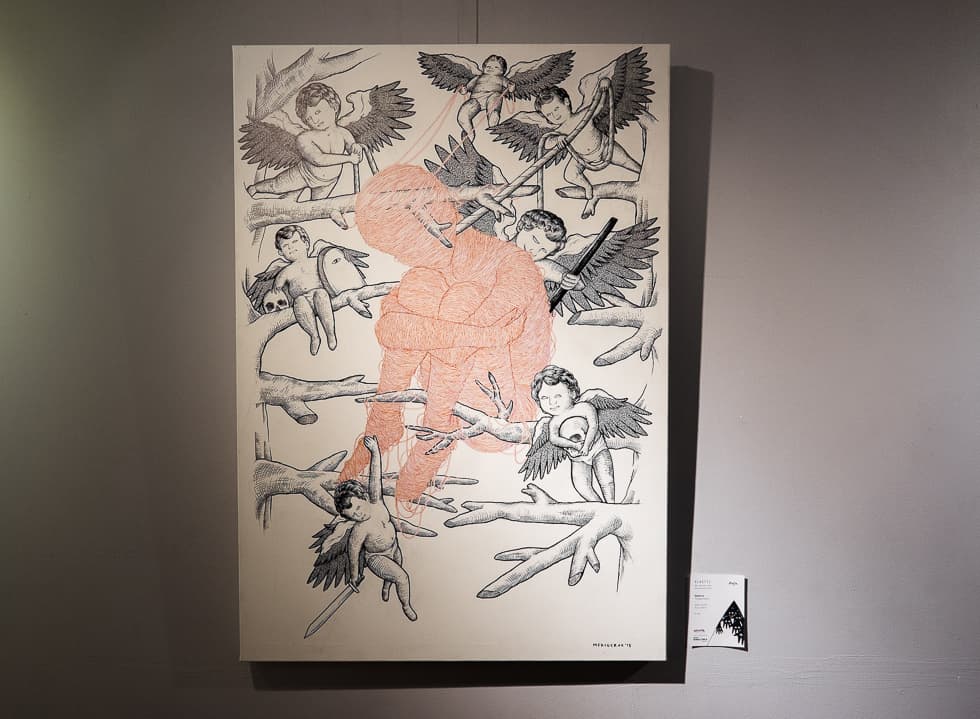
Mediocrux (Eugenia Ervi & Onel)
Artwork Title: “Friendly Enemies”
How do you interpret ‘PLASTIC’ through your artwork?
We want to show how we are constantly surrounded by people who don’t always have our best interest in mind. We drew angels to represent how people are sweet on the outside, but then they could stab us from the back. The story is about how people we keep around can be destructive without us knowing.
We know that you guys are a couple – not only relationship-wise, but also professionally as working partners. How do you balance your personal styles and have such harmony in your work?
My [Ervi] style of drawing consists of strings, which you can see in the protagonist. Onel is a tattoo artist, so he draws a lot of lines. We just decided to mix it up, keep things simple but give a lot of attention to details. We both like drawing eyes and hands because whatever we do, we need our eyes to see and our hands to make. Media-wise, we relied on using markers.
How do you feel about events like this in raising awareness of both local artists and Indonesian modern art?
I think it is a great platform to prove that we [artists] do have opinions and ideas on current issues. People have this misconception that art these days are copies, but if you go pass the surface, you can see that there is more to art than that. Especially when given a theme, just like this exhibition, which pushes the artists to think and visualize their own original interpretations on specific topics.
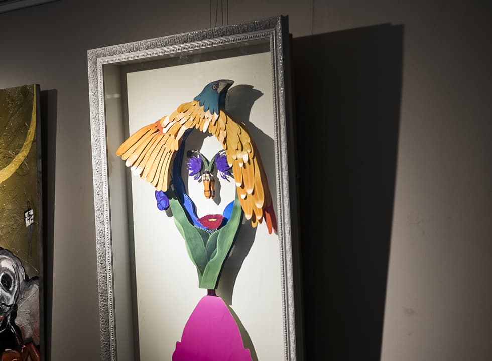
Diraratri HG
Artwork Title: “Segala yang indah dapat dilihat dengan pikiran yang tenang”
Visually, your artwork is very different from the rest. Can you tell us more about your concept for your piece?
I was definitely inspired by beauty. Here we have a facial expression of how beauty is obtained in a calm situation and a peaceful heart. When everything is chaotic, you miss everything. But when you’re at peace, you will feel that everything around you is beautiful.
The bird is very dominant in your artwork. Is there any specific reasons on choosing bird?
I think bird is something the best representation of fauna, as reflected by the beauty of its wings, each and every of its feather.
How would you describe your aesthetic?
Personally, I love flora and fauna. It’s a big part of my style in art. As for the media itself, since 2013, I’ve started experimenting with things other than classic canvas and paint.
This time I wanted to give my work more depth and therefore, I created this pop-up effect on my paper cut-out artwork. In addition, I used vibrant colours too. The illustrations were made digitally, then printed on cardstock and cut out into this shape. The whole process took about a week.
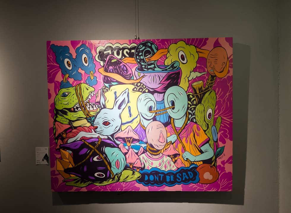
Muchlis Fahri (a.k.a Muklay)
Artwork Title: “Happy with this crowd and don’t be sad”
We’re quite curious about the origin of the name ‘Muklay’. Enlighten us, please.
Good question! It went back to high school when we gave each other petnames by taking the first syllable, and adding a ‘-lay’ suffix. My name is Muchlis, so I became “Muklay” and it kind of just stuck until now.
What does ‘PLASTIC’ mean to you?
Plastic is a non-degradable object and therefore, indestructible. To me, some of the things that would never die are the crowdedness of Jakarta and the chaotic nature of my life. The inspiration came in the middle of my ride home. At that time, I looked around and realised that all people around me were so worn out and looked half-alive.
That’s why I created a collage of many different icons on top of one another in order to create a chaos. But I threw in a vibrant, sweet colour-scheme that is somehow cohesive, in order to say “Hey, we have to stay positive and embrace it!”
We can see exactly what you mean. There’s so many things going on in this picture. Can you walk us through the process of creating this artwork?
I appreciate process more than anything so this one took about two weeks. The initial sketch is the most important part, the final media is only the executor. I sketched on paper using chinese ink because it’s more precise and doesn’t leak. Next, I digitised the sketch and edited the colours digitally. Once I’m satisfied with the sketch and colours, I used a colour chart to get the exact painting colours I wanted into little paint cups. The digital image then projected to a canvas, and lastly, I paint and do my thing.
Indeed, there’s so many characters in this painting. They actually had appeared for a number of times in my previous artworks. I have a collection of about 100 characters in my book that I take turns using for different projects. All of the ones featured here represents the different and the quirky. I try not to overthink everything and just feel like adding them in as I go.
Roots & Co., Hilma Sophia, Mediocrux, Diraratri, and Muklay as well as the rest of 20 local artists are currently showcasing their artworks on Plastic Art Exhibition. The exhibition runs from September 4th to October 15th at ARTOTEL Thamrin Jakarta.
ARTOTEL Jakarta
Jalan Sunda No.3, Jakarta Thamrin,
DKI Jakarta 10350